Jetpack Compose provides a basic implementation of the switch component but you can create a custom switch component by leveraging the power of Composes’ declarative UI approach. And if you are looking for a library for the switch in jetpack compose then I have a suggestion for you. The Heart Switch library provides a custom switch of the heart shape.
What’s in this post
- Heart Switch Library
- Creating your own Custom Switch
Heart Switch Library
It is a nice library created by Anton Popov, a GitHub user, who provides a custom implementation of the switch component of Jetpack Compose.

Implementation
Add the following code to your project’s settings.gradle file and press the Sync button
repositories {

        maven { url "https://jitpack.io" }
    }
Next, add the dependency below to your module’s build.gradle file and press the Sync button
dependencies {
    implementation "com.github.popovanton0:heart-switch:1.3.0"
}
Basic Usage
After the implementation of the library, just call the HeartSwitch function:
var myState by remember { mutableStateOf(false) }
HeartSwitch(
    checked = myState,
    onCheckedChange = { myState = it }
)
In the above code, we create a myState variable to hold the state of the switch.


Colors in Heart Switch
Let’s play with the different colours of the heart switch library.
Single Color
HeartSwitch(
            checked = myState,
            onCheckedChange = { myState = it },
            colors = HeartSwitchColors(
                Color.Green
            )
        )
Passing single colour to the HeartSwitchColors will change the colour of the thumb of the switch component.

Different Color
HeartSwitch(
            checked = myState,
            onCheckedChange = { myState = it },
            colors = HeartSwitchColors(
                checkedTrackColor = Color.Green,
                checkedThumbColor = Color.Cyan,
                checkedTrackBorderColor = Color.Yellow,
                uncheckedTrackColor = Color.Blue,
                uncheckedThumbColor = Color.Magenta,
                uncheckedTrackBorderColor = Color.Red
            )
        )

Customizing Thumb
Let’s change the shape of the thumb of the heart-switch library.
 HeartSwitch(
            checked = myState,
            onCheckedChange = { myState = it },
            thumb = { modifier, color ->
                Box(
                    modifier = modifier
                        .shadow(12.dp, RectangleShape)
                        .background(
                            Color.Green,
                            RectangleShape
                        )
                )
            }
        )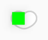

In the above code, thumb parameter of HeartSwitch function takes in a composable with two parameters one is a modifier and the other is color of type State<Color>.
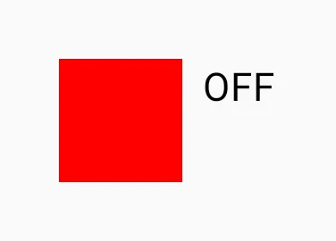
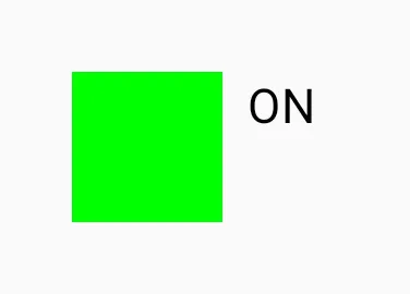
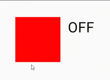
Creating Custom Switch
Let’s create our own custom switch. For this, we will create a CustomSwitch function that will take two parameters checked and onCheckedChange. The checked parameter represents the current state of the switch (whether it’s on or off), and onCheckedChange is a callback function that will be invoked when the switch state changes.
Inside the CustomSwitch composable, we define a Row composable that represents the switch’s layout. It consists of a Box with a background color that changes based on the checked state. When the user clicks on the Row, we toggle the checked state by invoking the onCheckedChange callback.
And inside the Row, we display the “ON” or “OFF” text next to the Box based on the checked state.
@Composable
fun CustomSwitch(
    checked: Boolean,
    onCheckedChange: (Boolean) -> Unit
) {
    Row(
        modifier = Modifier
            .clickable { onCheckedChange(!checked) }
            .padding(8.dp)
    ) {
        Box(
            modifier = Modifier
                .size(50.dp)
                .background(if (checked) Color.Green else Color.Red)
        )
        Text(
            text = if (checked) "ON" else "OFF",
            modifier = Modifier.padding(start = 8.dp)
        )
    }
}
Usages of CustomSwitch
We can use this function like the default switch component of jetpack compose or the heart switch library.
var myState by remember { mutableStateOf(false) }
        CustomSwitch(
            checked = myState,
            onCheckedChange = { myState = it }
        )
In the above code, we maintain the myState variable’s state using remember { mutableStateOf(false) }. The CustomSwitch composable is then used with the myState state and a lambda expression that updates the myState value when the switch is toggled.
By implementing a custom switch in Jetpack Compose, we can tailor the switch’s appearance and behaviour to our specific needs. With the example provided, you can start building your own custom switches in your Compose-based projects, offering a seamless and intuitive user experience. So go ahead and unleash your creativity to craft unique and delightful UI components using Jetpack Compose!
Happy Coding 🙂
One thought on “Heart Switch Library: A custom switch in Jetpack Compose”