Modifier in jetpack compose allows us to decorate or augment a composable. It helps in building complex UI components with ease by reusable components. Modifiers are one of the best features of android’s jetpack compose UI toolkit. They help in
- Change the composable size, layout, behavior, and appearance.
- Add information, like accessibility labels.
- Process user input.
- Add high-level interactions, like making an element clickable, scrollable, draggable, or zoomable.
Modifiers are standard Kotlin objects. Create a modifier by calling one of the Modifier class functions. Let’s explore functions that can be called modifier objects.
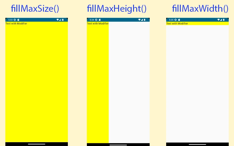
FillMaxSize – It helps child layout to fill all the available space allowed by the parent.
FillMaxWidth – It helps child layout to fill all the available width allowed by the parent.
FillMaxHeight – It helps child layout to fill all the available height allowed by the parent.
Text(
        text = "Text with Modifier",
        modifier = Modifier
            .fillMaxSize()
            .background(color = Color.Yellow)
    )
Text(
text = "Text with Modifier",
modifier = Modifier
.fillMaxHeight()
.background(color = Color.Yellow)
)Text(
text = "Text with Modifier",
modifier = Modifier
.fillMaxWidth()
.background(color = Color.Yellow)
)
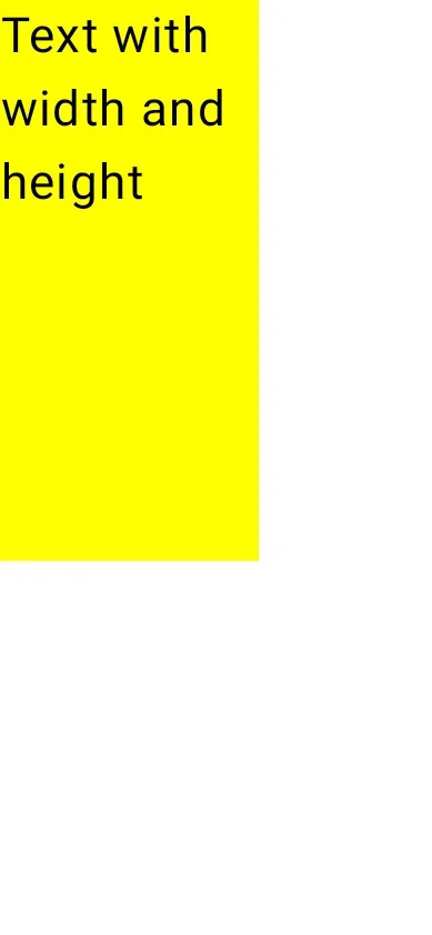
Note: Above written three modifiers take a parameter of type float (range 0 to 1) which select the fraction of maximum available size to use. Let’s take an example:
Text(
        text = "Text with width and height",
        modifier = Modifier
            .fillMaxSize(.6f)
            .background(color = Color.Yellow)
    )
Common Modifiers
Jetpack compose provides many build-in Modifiers that can be used to modify the appearance and behavior of UI components. Now we will discuss these modifiers and how to use them.
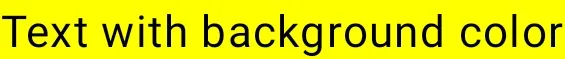
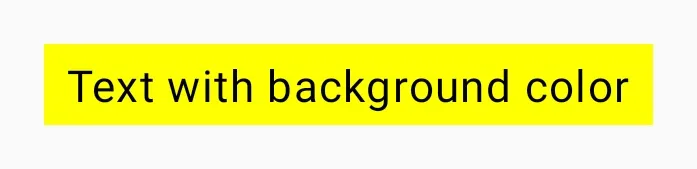
1. Background Color
It is used to set the color in the background of the component.
Text(
        text = "Text with background color",
        modifier = Modifier.background(color = Color.Yellow)
    )
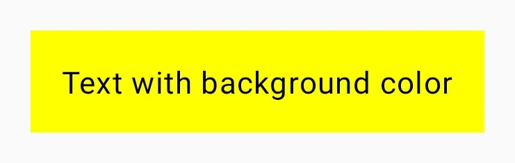
2. Padding
It adds padding to the UI component. Jetpack compose doesn’t have a modifier to set the margin for UI component that’s why we will use padding to set margin also.
Text(
        text = "Text with background color",
        modifier = Modifier
            .padding(16.dp)     // padding outside the color (margin)
            .background(color = Color.Yellow)
            .padding(16.dp)    // padding inside the color
    )
Note: Single value passed to the padding modifier function sets padding with that value to all sides of component. And to set padding individually you can provide different values. Let’s have an example.
Text(
        text = "Text with background color",
        modifier = Modifier
            .padding(16.dp) // padding outside the color (margin)
            .background(color = Color.Yellow)
            .padding(
                start = 8.dp,
                end = 8.dp,
                top = 4.dp,
                bottom = 4.dp
            ) // padding inside the color
    )
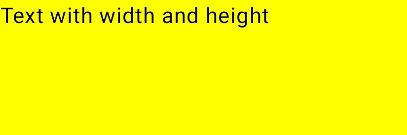
3. Width and Height
As the name suggest width(value: Dp) modifier adds width to the UI component and height(value: Dp) modifier adds height to the UI component.
Text(
        text = "Text with width and height",
        modifier = Modifier
            .width(300.dp)
            .height(100.dp)
            .background(color = Color.Yellow)
    )
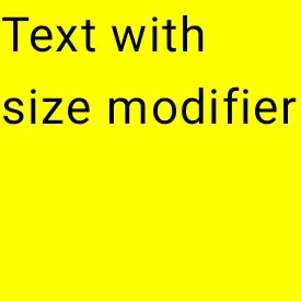
4. Size
Size modifer sets width and height for UI component with value provided and resultant UI component will be square in shape because of same width and height value. If you want different width and height for the UI component then give named parameter to size modifier function.
Text(
        text = "Text with size modifier",
        modifier = Modifier
            .size(100.dp)
            .background(color = Color.Yellow)
    )
Text(
        text = "Text with size modifier",
        modifier = Modifier
            .size(width = 200.dp, height = 100.dp)
            .background(color = Color.Yellow)
    )
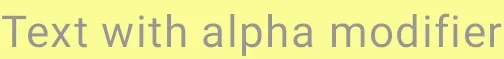
5. Alpha
Alpha modifier is used to set the opacity for the UI component.
Text(
        text = "Text with alpha modifier",
        modifier = Modifier
            .alpha(.4f)
            .background(color = Color.Yellow)
    )
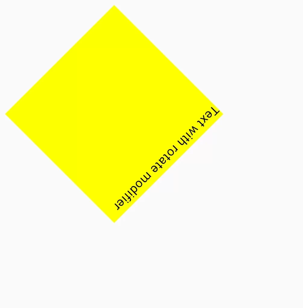
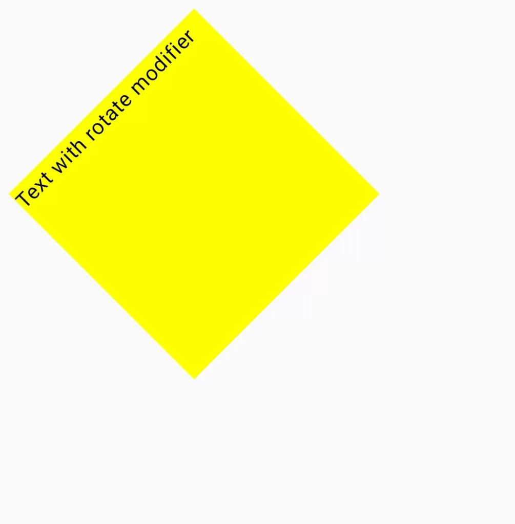
6. Rotate
It rotates the view with respect to the provided degree as a float value.
Note: Positive value results in clockwise rotation and Negative values result in counter clockwise rotation.
Text(
            text = "Text with rotate modifier",
            modifier = Modifier
                .size(200.dp)
                .rotate(135f)// degree as a float value
                .background(color = Color.Yellow)
        )
Text(
            text = "Text with rotate modifier",
            modifier = Modifier
                .size(200.dp)
                .rotate(-45f)// degree as a float value
                .background(color = Color.Yellow)
        )
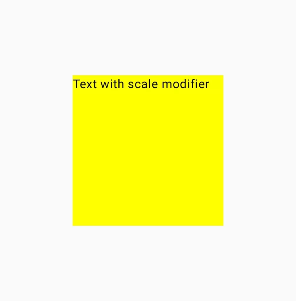
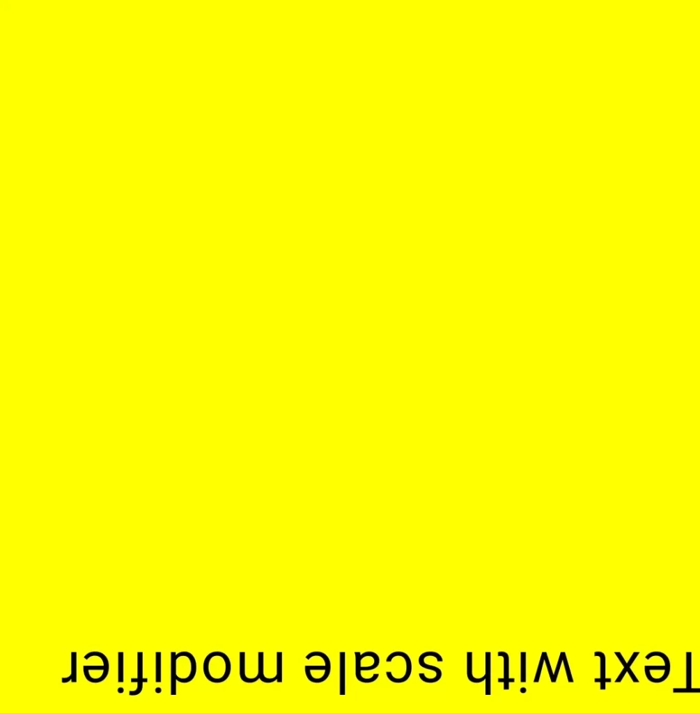
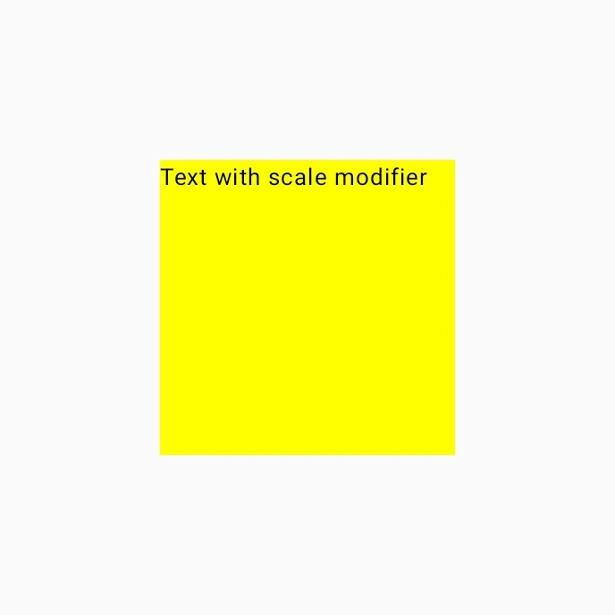
7. Scale
Scale modifier scales the content of both the horizontal and vertical axis uniformly by the same scale factor. And if negative value is provided then the content of UI component will be mirrored across the corresponding horizontal and vertical axis.
Text(
            text = "Text with scale modifier",
            modifier = Modifier
                .size(200.dp)
                .background(color = Color.Yellow)
        )
// code without scale
Text(
text = "Text with scale modifier",
modifier = Modifier
.size(200.dp)
.scale(2f)
.background(color = Color.Yellow)
)
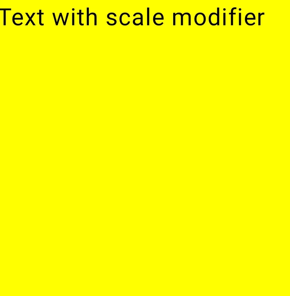
Outer box is 400.dp and yellow box is 200.dp and a scale with a value of 2f scaled to fit the yellow box in white box. It zooms in on the UI component 200%. If we provide negative values then it will create a mirrored UI component with same scale and if we want to zoom out then provide a value lower than 1f like .2f, .7f etc. Let’s take an example
Text(
            text = "Text with scale modifier",
            modifier = Modifier
                .size(200.dp)
                .scale(-2f)
                .background(color = Color.Yellow)
        )
Text(
text = "Text with scale modifier",
modifier = Modifier
.size(200.dp)
.scale(.6f)
.background(color = Color.Yellow)
)
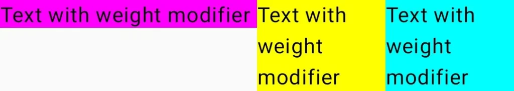
8. Weight
It specifies a size ratio between multiple UI components. Weight modifier is only available in Row and Column layout in jetpack compose. In Row layout, it sizes the element’s width proportional to its weight relative to another weighted sibling element in the layout. In Column layout, it sizes the element’s height proportional to it height relative to another weighted sibling element in the layout. Let’s take example:
Row() {
        Text(
            text = "Text with weight modifier",
            modifier = Modifier
                .weight(1f)
                .background(color = Color.Magenta)
        )
        Text(
            text = "Text with weight modifier",
            modifier = Modifier
                .weight(1f)
                .background(color = Color.Yellow)
        )
        Text(
            text = "Text with weight modifier",
            modifier = Modifier
                .weight(1f)
                .background(color = Color.Cyan)
        )
    }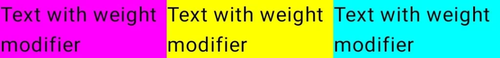
Note: Weight with 1f as a value provides equal space to all elements. You can play with different values like 2f to magenta color and 1f to both yellow and cyan element will give 50% space to magenta color and half – half of other 50 % to yellow and cyan color element.
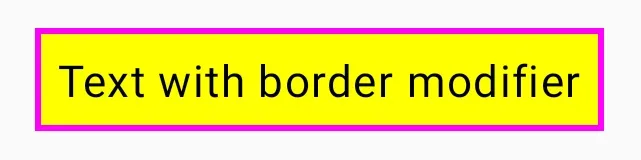
9. Border
This modifier adds borders to the UI element with specified width, color and shape.
1. Simple Border
Text(
            text = "Text with border modifier",
            modifier = Modifier
                .border(width = 2.dp, color = Color.Magenta)
                .background(color = Color.Yellow)
                .padding(8.dp)
        )
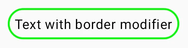
2. Circle Shape Border
Text(
            text = "Text with border modifier",
            modifier = Modifier

                .border(width = 2.dp, color = Color.Green, CircleShape)
                .padding(8.dp)
        )
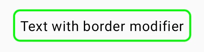
3. Rounded Corner Border
Text(
            text = "Text with border modifier",
            modifier = Modifier
                .border(
                    width = 2.dp,
                    color = Color.Green,
                    shape = RoundedCornerShape(8.dp)
                )
                .padding(8.dp)
        )
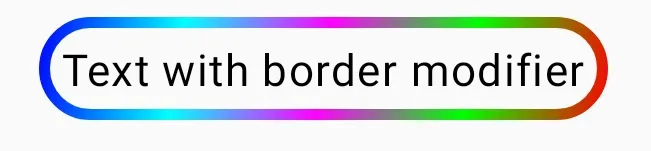
4. Gradient Color Border using Brush
Text(
            text = "Text with border modifier",
            modifier = Modifier
                .border(
                    width = 4.dp,
                    brush = Brush.linearGradient(
                        colors = listOf(
                            Color.Blue,
                            Color.Cyan,
                            Color.Magenta,
                            Color.Green,
                            Color.Red
                        )
                    ),
                    shape = CircleShape
                )
                .padding(8.dp)
        )
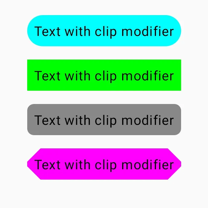
10. Clip
This modifier clips the provided content to the chosen shape. You can use the default shape provided by material3 library or customize your own shape. Default available shapes are:
- Circle Shape
- Rectangle Shape
- Rounded Corner Shape
- Cut Corner Shape
Column(
        modifier = Modifier
            .size(250.dp)
            .padding(8.dp),
        horizontalAlignment = Alignment.CenterHorizontally,
        verticalArrangement = Arrangement.Center
    ) {
        //circle shape
        Text(
            text = "Text with clip modifier",
            modifier = Modifier
                .padding(bottom = 16.dp)
                .clip(CircleShape)
                .background(color = Color.Cyan)
                .padding(8.dp)
        )
        // rectangle shape
        Text(
            text = "Text with clip modifier",
            modifier = Modifier
                .padding(bottom = 16.dp)
                .clip(RectangleShape)
                .background(color = Color.Green)
                .padding(8.dp)
        )
        // rounded corner shape
        Text(
            text = "Text with clip modifier",
            modifier = Modifier
                .padding(bottom = 16.dp)
                .clip(RoundedCornerShape(8.dp))
                .background(color = Color.Gray)
                .padding(8.dp)
        )
        // cut corner shape
        Text(
            text = "Text with clip modifier",
            modifier = Modifier
                .padding(bottom = 16.dp)
                .clip(CutCornerShape(16.dp))
                .background(color = Color.Magenta)
                .padding(8.dp)
        )
    }
That’s all for the basic modifiers. I hope the content is helpful.
Official documentation link for Modifier
12 thoughts on “Jetpack Compose Modifiers”