Jetpack compose, a modern UI toolkit for building Android UI using Kotlin programming language as a declarative programming model. Jetpack Compose Modifiers is an object that you will use most of the time while creating UI in Android using jetpack compose. It does all the tasks like giving padding, margin, shaping an element, giving color to a UI component or to the background and border etc. You can check out our last post which talks about the basics of modifiers.
A modifier makes elements of UI alive by making them clickable, scrollable, draggable, or zoomable. In this post, we will discuss advanced uses of jetpack compose’s modifier object.
Order of modifiers matters (Modifiers chaining)
1. What is Modifier Chaining
Calling of a bunch of modifiers together on the same modifier object. Example:
Text(
            text = "Hello Jetpack Compose",
            modifier = Modifier
                .padding(bottom = 16.dp)
                .clip(RectangleShape)
                .background(color = Color.Green)
                .padding(8.dp)
        )
In the above code block, we are calling padding(), clip(), background() and padding() functions again on the same modifier object. This is called modifier chaining.
2. Ordering of Jetpack Compose Modifiers
The order of the modifiers function is very important because each function makes changes to the Modifier returned by the previous function, the sequence affects the final result. Ordering matters because modifier elements that are added first will be applied first. Let’s take an example:
Image(
            painter = painterResource(id = R.drawable.cat),
            contentDescription = null,
            modifier = Modifier
                .clickable { }
                .padding(16.dp)
                .clip(RoundedCornerShape(16.dp))
        )
In the above code, the whole area is clickable, including the padding, because the padding modifier has been applied after the clickable modifier, that’s why it made the UI component clickable first and then added padding. Now, if we reverse the order of clickable and padding modifier, the space added by the padding modifier does not react to user input. Let’s do this:
Image(
            painter = painterResource(id = R.drawable.cat),
            contentDescription = null,
            modifier = Modifier
                .padding(16.dp)
                .clickable { }
                .clip(RoundedCornerShape(16.dp))
        )
Now the padding area is not clickable but the area of the image which is modded by the clip modifier is clickable due to the same reason for calling the clickable modifier earlier than the clip. Let’s modify this:
Image(
            painter = painterResource(id = R.drawable.cat),
            contentDescription = null,
            modifier = Modifier
                .padding(16.dp)
                .clip(RoundedCornerShape(16.dp))
                .clickable { }
        )
paddingFromBaseline Modifier
In the last post of modifiers, we talked about padding modifier which gives padding all around the UI element. Use the paddingFromBaseline modifier to achieve a specific distance from the top of the layout to the baseline. It will add padding above a text baseline.
Column{
        Text(
            text = "Padding From Baseline",
            modifier = Modifier.paddingFromBaseline(top = 50.dp)
        )
        Text(text = "Second text")
    }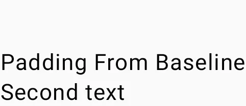
In the above code, padding is given from the baseline of the “Padding from Baseline” text element.
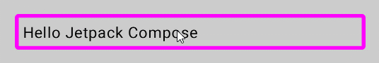
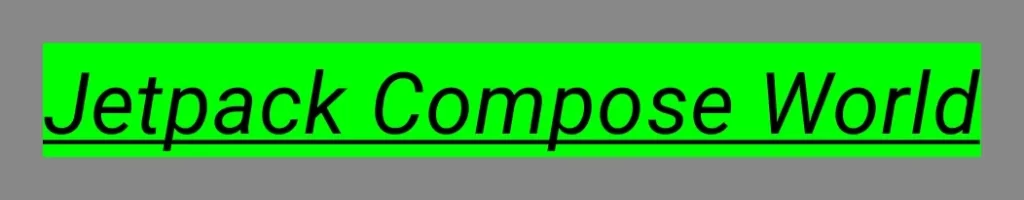
Clickable Modifier
As the name suggests, this modifier makes the element clickable or makes them able to respond on click. In the below code block, I suggest you ignore myColor variable initialization if you are a beginner. Let’s understand the code, firstly we created a variable named myColor which holds the initial colour for the border then in the clickable lambda function we assigned a different colour to myColor variable which causes the border to change colour on clicking the text element.
var myColor by remember {
    mutableStateOf(Color.Magenta)
}
Column {
    Text(
        text = "Hello Jetpack Compose",
        modifier = Modifier
            .fillMaxWidth()
            .background(Color.LightGray)
            .padding(16.dp)
            .border(4.dp, myColor, RoundedCornerShape(4.dp))
            .padding(8.dp)
            .clickable {
                myColor = Color.Green
            }
    )

}
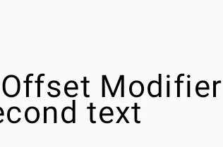
Offset Modifier
It allows an element to position itself relative to its original position. Offsets can be positive as well as non-positive and it takes two parameters, one for the x-axis and other for the y-axis.
Column{
        Text(
            text = "Offset Modifier",
            modifier = Modifier.paddingFromBaseline(top = 50.dp)
        )
        Text(
            text = "Second text",
            modifier = Modifier.offset(x = 16.dp)
        )
    }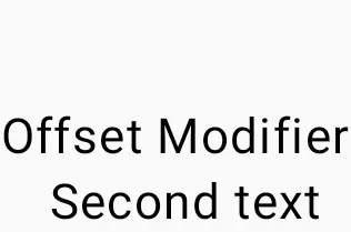
In the above image, the second text element shifts to the right by 16 dp because of the offset modifier. Now, you will say what is the difference between offset and padding modifiers? The difference between padding and offset is that adding an offset to a composable does not change its measurements.
The offset modifier is applied horizontally according to the layout direction. In a left-to-right context, a positive offset shifts the element to the right, while in a right-to-left context, it shifts the element to the left. In the case of a negative value, the direction will be exactly opposite to the original. Let’s take the example of a negative offset and consider both parameters x and y.
Column {
        Text(
            text = "Offset Modifier",
            modifier = Modifier.
            paddingFromBaseline(top = 50.dp)
        )
        Text(
            text = "Second text",
            modifier = Modifier.offset(
                x = 16.dp,
                y = 6.dp
            )
        )
    }
Column {
Text(
text = "Offset Modifier",
modifier = Modifier.
paddingFromBaseline(top = 50.dp)
)
Text(
text = "Second text",
modifier = Modifier.offset(
x = -(16).dp,
y = -(8).dp
)
)
}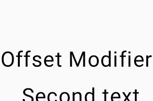
In the above code, the offset modifier takes two parameters x and y. The x parameter defines offset horizontally and the y parameter defines offset vertically. In the left image, the 16.dp value of the x parameter shifts the text element rightward and 6.dp value of the y parameter shifts the text element downward. And in the right image, the negative value of the x parameter shifts the text element leftward and the negative value of the y parameter shifts the text element upward.
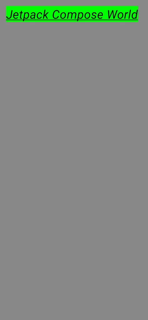
matchParentSize Modifier
This modifier is only available to the child of the Box layout of the jetpack compose. Therefore, it can only be used on a child within a Box parent. If you want to make a child as big as the parent Box without affecting the Box size, use the matchParentSize modifier. Let’s take an example:
Box {
        Spacer(
            modifier = Modifier
                .matchParentSize()
                .background(Color.Gray)
        )
        WebsiteNameShower()
    }
In the above code, the child Spacer takes its size from its parent Box, which in turn takes its size from the biggest children, WebsiteNameShower in this case. The complete code including the WebsiteNameShower function.
If fillMaxSize were used instead of matchParentSize, the Spacer would take all the available space allowed to the parent in turn causing the parent to expand and fill all the available space. Let’s take an example:
Box {
        Spacer(
            modifier = Modifier
                .fillMaxSize()
                .background(Color.Gray)
        )
        WebsiteNameShower()
    }
Reusing Jetpack Compose Modifiers ( Extracted Modifiers )
Sometimes it can be beneficial to reuse the same modifier chain instances in different composable, by extracting them into variables and hoisting them into higher scopes. Benefits of doing this:
- It can improve the readability of code.
- It can improve app performance because reallocation of the modifiers won’t be repeated when recomposition occurs for composable that use them.
- Modifier chains could be very long and complex, so reusing them can alleviate the workload Compose runtime.
- It also promotes code cleanliness, consistency and maintainability across the codebase.
Let’s understand this with an example:
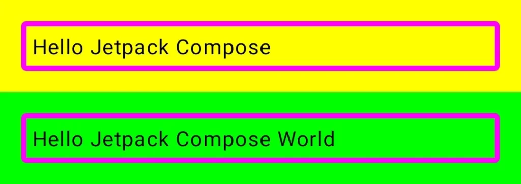
Column {
        Text(
            text = "Hello Jetpack Compose",
            modifier = Modifier
                .fillMaxWidth()
                .background(Color.Yellow)
                .padding(16.dp)
                .border(4.dp, Color.Magenta, RoundedCornerShape(4.dp))
                .padding(8.dp)
        )
        Text(
            text = "Hello Jetpack Compose World",
            modifier = Modifier
                .fillMaxWidth()
                .background(Color.Yellow)
                .padding(16.dp)
                .border(4.dp, Color.Magenta, RoundedCornerShape(4.dp))
                .padding(8.dp)
        )
    }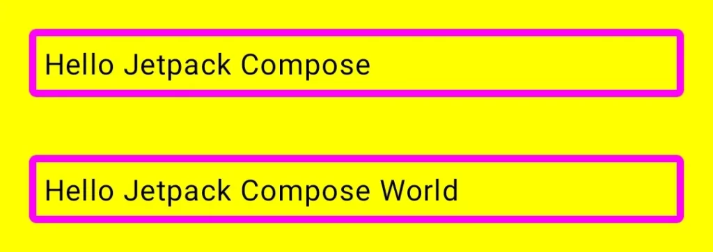
In the above code, we can see that both text elements are taking the same modifier object and when recomposition will occur it will take extra time to load. Now we can solve this problem by creating a variable of modifier and then using the same variable in both text elements. Let’s see:
val reusableModifier = Modifier
        .fillMaxWidth()
        .background(Color.Yellow)
        .padding(16.dp)
        .border(4.dp, Color.Magenta, RoundedCornerShape(4.dp))
        .padding(8.dp)

    Column {
        Text(
            text = "Hello Jetpack Compose",
            modifier = reusableModifier
        )
        Text(
            text = "Hello Jetpack Compose World",
            modifier = reusableModifier
        )
    }
And the output will be the same for this code block as well.
Chaining of Extracted Jetpack Modifiers
Let’s assume, that I want to give different background colors to the text elements in the above image and the remaining styling will be the same. In this case, we will use .then() function to further append or chain extracted modifiers. Let’s take an example:
val reusableModifier = Modifier
        .fillMaxWidth()
        .padding(16.dp)
        .border(4.dp, Color.Magenta, RoundedCornerShape(4.dp))
        .padding(8.dp)

    Column {
        Text(
            text = "Hello Jetpack Compose",
            modifier = Modifier
                .background(Color.Yellow).then(reusableModifier)
        )
        Text(
            text = "Hello Jetpack Compose World",
            modifier = Modifier
                .background(Color.Green).then(reusableModifier)
        )
    }
Note: Always remember the order of modifiers matters.
Well, that’s all for advanced uses of jetpack compose modifiers. Jetpack Compose Modifier is a powerful tool for building impressive UI with ease. I know, it could be cumbersome to understand modifiers but I can assure you, without having a good knowledge of the modifiers, no one can go far. So, take a break if needed and come back and start where you left off.
Happy Coding 🙂