Jetpack Compose is making Android app development very easy and interesting for beginners with its declarative programming. LazyColumn is one of the powerful features of Jetpack Compose, which provides an efficient way to display large lists. Jetpack Compose LazyColumn is the successor of RecyclerView and Adapter.
LazyColumn display a large number of items efficiently in the vertically scrollable list. If you have a small list and your use case doesn’t require scrolling then you can go with Column to display the list. Because Column doesn’t support scroll by default and you can use verticalScroll() modifier to make the column scrollable. Let’s take an example of Column to show a simple list of country names:
@Composable
fun ListShower() {
    val countryNames = listOf("India", "China", "Pakistan", "Sri Lanka", "Nepal")
    Column {
        countryNames.forEach { country ->
            Text(text = country)
        }
    }
}
Let’s understand the above-written code, firstly we created a list of type string named countryNames. Now, in the column layout, we use forEach the high-order function of Kotlin to iterate over each name in the list and set the name to Text composable function.
Note: To learn more about the high-order function of Kotlin
Making Column Scrollable
Column by default doesn’t support scrolling and to make it scrollable, we will use verticalScroll modifier, which takes rememberScrollState() function as a parameter. In the below code, countryNames list shows (...) because the list was too long that’s why we used this, if you want to copy the code then create a list first otherwise code won’t work.
@Composable
fun ListShower(modifier: Modifier) {
    val countryNames = listOf(

...)
    Column(modifier = modifier.verticalScroll(rememberScrollState())) {
        countryNames.forEach { country ->
            Text(text = country, fontSize = 32.sp)
        }
    }
}
Let’s get back to the LazyColumn which is our main topic. We use a lazy column instead of a column because, in the case of a list having a large number of items, can cause performance issues.
LazyColumn
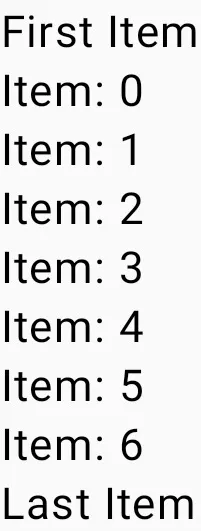
In the LazyColumn, we use item() for a single item and items() function for multiple items.
@Composable
fun LazyColumnShower(modifier: Modifier) {
    LazyColumn {
        //Adding a single item
        item {
            Text(text = "First Item")
        }
        // Adding 7 items
        items(7) {
            Text(text = "Item: $it")
        }
        //adding another single text
        item {
            Text(text = "Last Item")
        }
    }
}
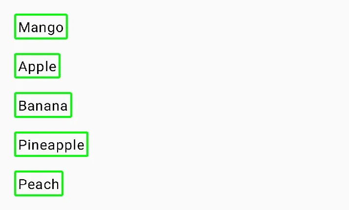
1. Simple List
Showing a simple list using LazyColumn an extension function that allows you to display Kotlin collections of items.
@Composable
fun LazyColumnShower1() {
    val fruitName = listOf("Mango", "Apple", "Banana", "Pineapple", "Peach")
    val textModifier = Modifier
        .padding(8.dp)
        .border(2.dp, Color.Green, RoundedCornerShape(2.dp))
        .padding(4.dp)
    val columnModifier = Modifier
        .fillMaxWidth()
        .background(Color.Transparent)
        .padding(8.dp)

    LazyColumn(modifier = columnModifier) {
        items(fruitName) { fruit ->
            Text(text = fruit, modifier = textModifier)
        }
    }
}
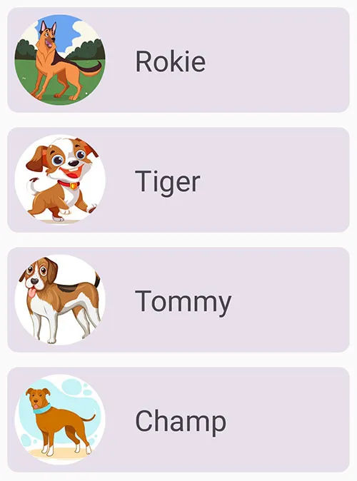
2. Advance List
In this section, we will build an application that shows different dog information in a vertical list.
Note: Always pass a Modifier as a parameter to every composable function. Because it gives you more freedom to manipulate the layout outside of a function.
1. Create a data class
A data class holds the data.
Dog.kt
import androidx.annotation.DrawableRes
import androidx.annotation.StringRes

data class Dog(
    @StringRes val nameResourceId: Int,
    @DrawableRes val imageResourceId: Int
)
In the above code, the variable nameResourceId and imageResourceId are annotated with @StringRes and @DrawableRes.
nameResourceId– It represents an ID for the dog name text stored in the string resource.imageResourceId– it represents an ID for the dog image stored in the drawable resource.
Note: Never use strings directly in the code, always store them in a string resource file (strings.xml) located at /res/values/
2. Add strings and images
strings.xml
<resources>
<string name="app_name">Lazy Column</string>
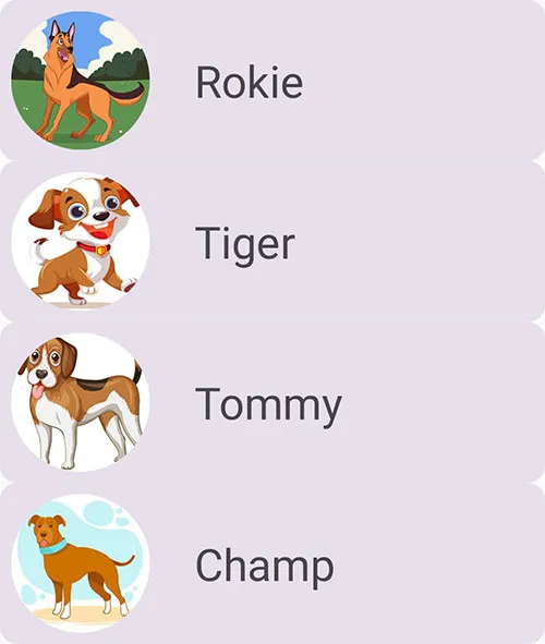
<string name="dog1">Rokie</string>
<string name="dog2">Tiger</string>
<string name="dog3">Tommy</string>
<string name="dog4">Champ</string>
<string name="dog5">Cypher</string>
</resources>Drawable folder
3. Dog List
Now, we will create a function that will return a list of dog data class.
fun dogList(): List<Dog> {
    return listOf(
        Dog(R.string.dog1, R.drawable.dog1),
        Dog(R.string.dog2, R.drawable.dog2),
        Dog(R.string.dog3, R.drawable.dog3),
        Dog(R.string.dog4, R.drawable.dog4),
        Dog(R.string.dog5, R.drawable.dog5),
        Dog(R.string.dog1, R.drawable.dog1),
        Dog(R.string.dog2, R.drawable.dog2),
        Dog(R.string.dog3, R.drawable.dog3),
        Dog(R.string.dog4, R.drawable.dog4),
        Dog(R.string.dog5, R.drawable.dog5)
    )
}
4. Dog Card
Now, we will create a basic layout for presenting the dog image and name. We will be using the Card element of jetpack compose and Row layout. We haven’t discussed Card yet. But in a future post, will discuss Card element of jetpack compose.
@Composable
fun DogCard(dog: Dog, modifier: Modifier) {
    Card(modifier = modifier) {
        Row(
            modifier = Modifier.fillMaxWidth().padding(8.dp),
            verticalAlignment = Alignment.CenterVertically,
            horizontalArrangement = Arrangement.spacedBy(32.dp)
        ) {
            Image(
                painter = painterResource(id = dog.imageResourceId),
                contentDescription = stringResource(id = dog.nameResourceId),
                modifier = Modifier
                    .size(100.dp)
                    .clip(CircleShape),
                contentScale = ContentScale.Crop
            )
            Text(text = stringResource(id = dog.nameResourceId), fontSize = 32.sp)
        }
    }
}
stringResource – This function fetches the string from strings.xml by taking id as a parameter.
Arrangement.spacedBy(32.dp) – This function places every child in a horizontal space of 32.dp ( space -in-between each item ) and this is also known as content spacing.
5. LazyColumn
Lastly, we will create a function that takes two parameters. The first one is a list of dog class and the second one is a Modifier.
@Composable
fun AdvanceLazyColumnShower(dogList: List<Dog>, modifier: Modifier) {
    LazyColumn(modifier = modifier) {
        items(dogList) { dog ->
            DogCard(dog = dog, modifier = Modifier.padding(8.dp))
        }
    }
}
In the lambda body of the LazyColumn, we call the items() function and pass in the dogList. The items() function is how you add items to the LazyColumn. This method is somewhat unique to this composable and is otherwise not a common practice for most composables.
In items() function lambda body dog parameter represents one dog item from the dogList.
Modifier.padding(8.dp) in the above code gives 8 dp space between each card. If we don’t use padding then the card will not have space between cards and will look like this:
Content Padding
If you want padding around the edges of the content. The lazy components allow you to pass some PaddingValues to the contentPadding parameter to support this:
@Composable
fun AdvanceLazyColumnShower(dogList: List<Dog>, modifier: Modifier) {
    LazyColumn(
        modifier = modifier,
        contentPadding = PaddingValues(horizontal = 8.dp, vertical = 8.dp)
    ) {
        items(dogList) { dog ->
            DogCard(dog = dog, modifier = Modifier.padding(vertical = 8.dp))
        }
    }
}
In the above code, we have added contentPadding, which gives padding of 8 dp around the edges of the content. And we change card padding to vertical. Because earlier it was giving padding of 8 dp around the whole card. Now we have provided contentPadding so there is no need to provide horizontal padding because it is being provided by contentPadding. And the output will be the same as the second last image in the post.
Horizontal Padding – It means left and right or start and end.
Vertical Padding – It means top and bottom.
Well, that’s all for jetpack compose lazycolumn. And I am providing a GitHub link to all code that we discussed in this post.
https://github.com/kalactor/LazyColumnforWebsite.git
Learn more about lists and grids at Official Documentation