Material Design Icons are a set of clean, visually appealing icons that follow Google’s Material Design guidelines. These icons come in sizes. Can be seamlessly incorporated into your Android app ensuring a cohesive and sophisticated appearance.
In this blog, we will learn how to use material icons in Jetpack Compose.
Prerequisites:
By default, Jetpack Compose provides a few sets of icons. There are two dependencies for extra icons in the Jetpack Compose. Add one of these dependencies in your dependencies block in build.gradle.kts (Module:app) file and press Sync Now
// This dependency contains most commonly used icons hence smaller in size.

implementation("androidx.compose.material:material-icons-core:1.5.3")
// This dependency contains all the material icons hence larger in size.
implementation("androidx.compose.material:material-icons-extended:1.5.3")NOTE:
- If you have such a large dependency in your production application then use Proguard to shrink application size by removing unused code and resources.
- It is recommended to not use a large dependency. Use the Google Fonts website that has the same material icons.
I hope you are using Material 3 in your project, if not then upgrade your project to Material 3.
Jetpack Compose by default provides three Icon APIs. And each one has one different parameter named bitmap, painter and imageVector. All take 4 parameters:
@Composable
fun Icon(
    imageVector: ImageVector,
    contentDescription: String?,
    modifier: Modifier = Modifier,
    tint: Color = LocalContentColor.current
)
Parameters Description:
- imageVector – it takes the icon as input in the form of a vector
- contentDescription – it is a string that describes the icon. And it helps the screen reader to better describe screen content.
- modifier – This parameter helps in modifying the layout of the icon.
- tint – The tint parameter sets the icon colour.
Simple Icon
Icon(imageVector = Icons.Default.Backup, contentDescription = null)
Icon Size
We can change the size of the icon using the size method of the modifier object. ( Modifier.size() ). The default size of the icon is 24.dp.
 Icon(
       imageVector = Icons.Default.Backup,
       contentDescription = null,
       modifier = Modifier.size(100.dp)
     )
Icon Color
We can change the colour of the icon using the tint parameter of Icon API.
Icon(
       imageVector = Icons.Default.Backup,
       contentDescription = null,
       modifier = Modifier.size(100.dp),
       tint = Color.Red
    )
Icon Background Color
We can use the background method of the modifier object to set the background colour of the icon.
Icon(
        imageVector = Icons.Default.Backup,
        contentDescription = null,
        modifier = Modifier.size(100.dp).background(Color.Cyan),
        tint = Color.Red
     )
Note: The material icons come in different styles. Instead of using Icons.Default, we can use these as well:
- Icons.Outlined
- Icons.Rounded
- Icons.Filled
Icons.TwoTone - Icons.Sharp
Let’s take a quick example of these:
        Icon(imageVector = Icons.Default.Image, contentDescription = null)
        Text(text = "Default")
        Icon(imageVector = Icons.Filled.Image, contentDescription = null)
        Text(text = "Filled")
        Icon(imageVector = Icons.Outlined.Image, contentDescription = null)
        Text(text = "Outlined")
        Icon(imageVector = Icons.Rounded.Image, contentDescription = null)
        Text(text = "Rounded")
        Icon(imageVector = Icons.TwoTone.Image, contentDescription = null)
        Text(text = "TwoTone")
        Icon(imageVector = Icons.Sharp.Image, contentDescription = null)
        Text(text = "Sharp")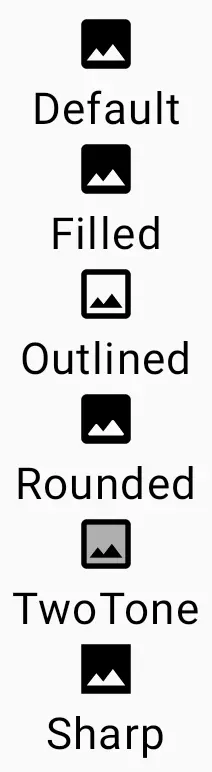
Painter Icon
This displays the icon from the drawable resource folder. It takes the same parameters instead of the painter.
@Composable
fun Icon(
    painter: Painter,
    contentDescription: String?,
    modifier: Modifier = Modifier,
    tint: Color = LocalContentColor.current
)
First, download an icon and place it in the res / drawable folder or generate using Vector Asset
Related Article: How to convert SVG files to XML in Android Studio
Icon(painter = painterResource(id = R.drawable.clock), contentDescription = null )
In the same way, We can use Bitmap Icon API too. I hope you will explore this one yourself. And I hope the content is helpful too. If you have doubts then please comment.
Happy Composing 🙂