Date Picker is a very important UI component for any application. Its uses range from a simple alarm, task manager applications to Facebook, Twitter to other big platform applications as well. Date Picker in Jetpack Compose is provided by material3 library.
Topics we will explore in this blog post:
- How to show date picker dialog?
- How to handle dismiss and confirm buttons?
- How to change colors or customize the date picker?
- How to give range of time to date picker?
- How to access the values from date picker state?
Note: Please note that, we are using “Android Studio Jellyfish | 2023.3.1” and we are using below given “composeBom” version.
composeBom = "2024.05.00"Before Date Picker Setup
I have written some basic code that includes a button and text composble inside a column and both are centered in the screen. The code and screen shot are given below:
    Column (
        modifier = Modifier.fillMaxSize(),
        verticalArrangement = Arrangement.Center,
        horizontalAlignment = Alignment.CenterHorizontally
    ) {
        Button(onClick = { /*TODO*/ }) {
            Text(text = "Pick Date")
        }
        Text(text = "Selected Date: ")
    }
How to Show Date Picker in Jetpack Compose
Well, it includes two composables, one is Date Picker and other is Date Picker Dialog. The date picker handles the date related things and date picker dialog handles the dialog which is will be shown to choose the date. Let’s see it in action:
First of all, we create two variables:
- dateDialogController – A Boolean value that is used to trigger dialog.
- dateState – It is a state variable for Date Picker which is remembered across compositions.
var dateDialogController by  remember { mutableStateOf(false) }
val dateState = rememberDatePickerState()
Now, we change the value of dateDialogController variable to true when someone click the button.
Button(onClick = { dateDialogController = true }) {
    Text(text = "Pick Date")
}
Now, we evaluate this variable in if block and if condition is true we call the date picker dialog and date picker inside the dialog by passing the state variable created earlier.
    if (dateDialogController) {
        DatePickerDialog(
            onDismissRequest = { /*TODO*/ },
            confirmButton = {
                TextButton(onClick = {
                    dateDialogController = false
                }) {
                    Text(text = "Ok")
                }
            }
        ) {
            DatePicker(state = dateState)
        }
    }
DatePickerDialog take two parameter onDismissRequest and confirmButton as compulsory parameters and their are some others too.
- onDismissRequest is called when user press back button or tap outside the date picker dialog. It is used to dismiss the dialog.
- confirmButton is called when user want to confirm the dates by pressing the button provided inside this composable.
How to handle dismiss and confirm buttons?
As discussed above the confirmButton parameter takes composable and we provided a button inside it to confirm and exit the dialog by setting dateDialogController variable to false. Now we will provide the dismissButton as well to dismiss the dialog by clicking on the button.
    if (dateDialogController) {
        DatePickerDialog(
            onDismissRequest = { dateDialogController = false },
            confirmButton = {
                TextButton(onClick = {
                    dateDialogController = false
                }) {
                    Text(text = "Yes")
                }
            },
            dismissButton = {
                TextButton(onClick = {
                    dateDialogController = false
                }) {
                    Text(text = "No")
                }
            }
        ) {
            DatePicker(state = dateState)
        }
    }
}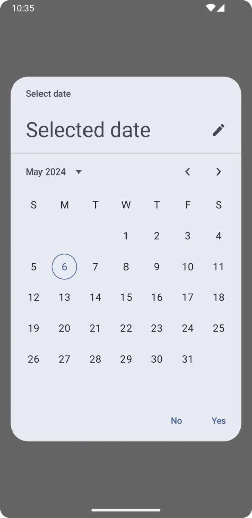
These small “Yes” and “No” are the TextButtons which are provided in the call the date picker dialog.
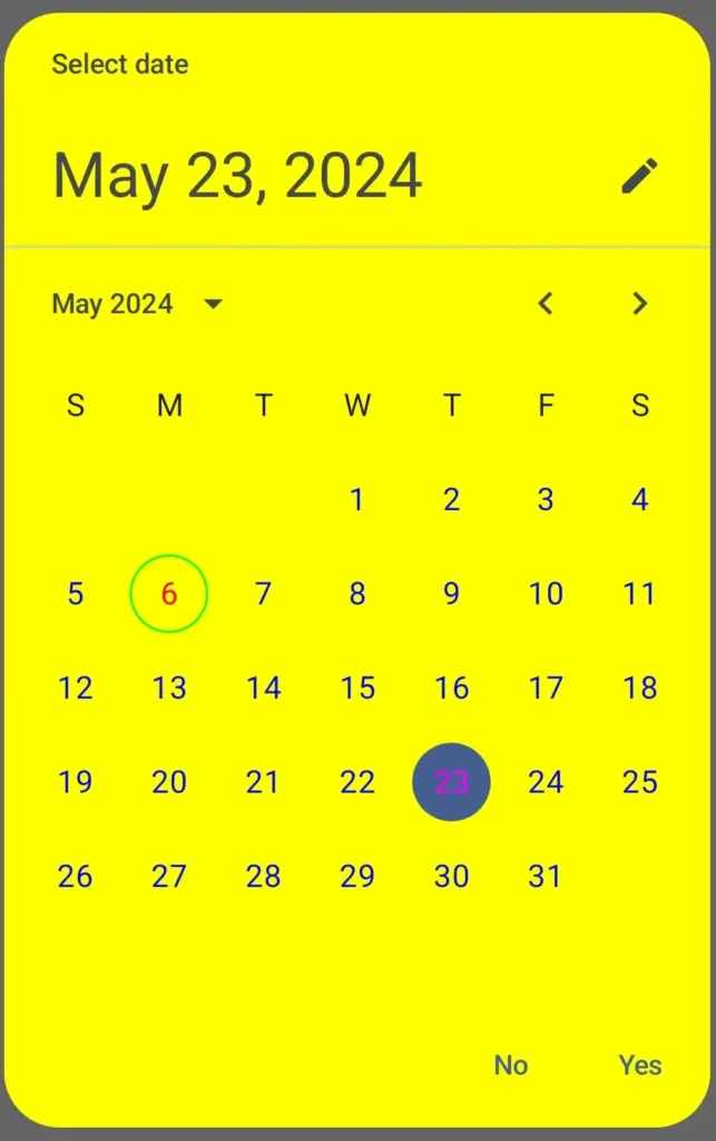
How to change colors or customize the date picker?
To make the date picker dialog beautiful, just pass in the colors parameters and provided the options according the name of the parameters of colors paramter. It accept many thing, we will change a bit not all, let’s see how:
// same as above //

 colors = DatePickerDefaults.colors(
        containerColor = Color.Yellow
    )
) {
    DatePicker(
        state = dateState,
        colors = DatePickerDefaults.colors(
            todayContentColor = Color.Red,
            todayDateBorderColor = Color.Green,
            dayContentColor = Color.Blue,
            selectedDayContentColor = Color.Magenta
        )
    )

// same as above //
How to give range of time to date picker?
We can give the user a range only from that range user can select the date from the date picker dialog. There are no direct functions to achieve this. But we can do this by passing the date and range to dateState variable which we create at the very beginning of our this blog. Let’s see it in action:
    val currentDate = remember {
        Calendar.getInstance().apply {
            set(Calendar.YEAR, 2024)
            set(Calendar.MONTH, 5)
            set(Calendar.DAY_OF_MONTH, 5)
        }.timeInMillis
    }

    val dateState = rememberDatePickerState(
        initialSelectedDateMillis = currentDate,
        yearRange = 1990..2024
    )
In the currentDate variable, we get the today’s date in milliseconds and then pass it to the rememberDatePickerState as initialSelectedDateMillis and yearRange also.
Now if you click on the year then the range appear is only between 1990 to 2024.
How to access the values from date picker state?
There are no listener or callback to the date picker so we have to calculate the values when the user clicks on the confirm button or the dismiss button. Let’s see, how can we achieve this:
Well there are many ways to do this. First we create a variable of type Long which hold the selected date
var selectedDate by remember { mutableLongStateOf(0L) }Now, when user clicks the confirm button, we will save the selected date in milliseconds to the above created variable.
Note: We must change the before assisgn that if the value is null or not. Otherwise it will throw NULLPOINTEREXCEPTION.
      DatePickerDialog(
            onDismissRequest = { dateDialogController = false },
            confirmButton = {
                TextButton(onClick = {
                    if(dateState.selectedDateMillis != null){
                        selectedDate = dateState.selectedDateMillis!!
                    }
                    dateDialogController = false
                }) {
                    Text(text = "Yes")
                }
            }
Now, we can format this selected date also so to achieve this we can use Date class.
The below given function can help in converting long date to a simple date.
fun convertLongToDate(time: Long): String {
    val date = Date(time)
    val format = SimpleDateFormat.getDateInstance()
    return format.format(date)
}
Summary
This blog post contains a lot about Date Picker Dialog and Date Picker itself. So, we can say that we explored many thing about date picker like year range to customization of the dialog. I hope this post is useful.
Happy Composing 🙂
One thought on “Date Picker in Jetpack Compose”