In today’s mobile app development, providing users with the ability to rate and review content is crucial for gathering feedback and improving the overall user experience. Jetpack Compose, the modern UI toolkit from Google, offers a powerful and flexible way to build dynamic user interfaces. In this blog post, we will explore how to create a rating bar component in Jetpack Compose, allowing you to engage users and gather valuable insights effortlessly.
Minimum Requirement
You should be aware of:
- Modifiers
- Kotlin Function
- Jetpack Composable Function
- Kotlin if / else statement
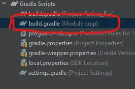
Note: We use the Material 3 library in our all posts. In this post, we are using the extended material icons library. To implement this library, copy the below code and paste it into the dependency block of your build.gradle file at app the level (file is shown in the figure below).
implementation 'androidx.compose.material:material-icons-extended-android:1.5.0-beta02'Custom Rating Bar in Jetpack Compose
First of all, we will create a function that will have four parameters: two are optional and two are compulsory.
maxRating– The maximum rating value for the rating bar. (Default value is 5) (optional parameter)currentRating– The current rating value.onRatingChanged– A callback function that is called when the user changes the rating.starsColor– The colour of the rating star. (Default value is Yellow) (optional parameter)
Now our function looks like this:
@Composable
fun RatingBar(
    maxRating: Int = 5,
    currentRating: Int,
    onRatingChanged: (Int) -> Unit,
    starsColor: Color = Color.Yellow
)
Now, we will use Row to display a series of Icon components, representing the stars. And in the Row layout, we use for loop to create a series of star Icon up to maxRating.
Now, inside the for loop, we create the Icon component and the Icon component’s imageVector parameter is set based on whether the star should be filled or outlined, depending on the currentRating value. And the same logic is applicable to the tint of the Icon component. Let’s see the code so far:
Row {
        for (i in 1..maxRating) {
            Icon(
                imageVector = if (i <= currentRating) Icons.Filled.Star
                else Icons.Filled.StarOutline,
                contentDescription = null,
                tint = if (i <= currentRating) starsColor
                else Color.Unspecified,
                modifier = Modifier
                    .clickable { onRatingChanged(i) }
                    .padding(4.dp)
            )
        }
    }
Color.Unspecified – We use unspecified for outlined stars or non-rated stars and this represents an unset value without having to box the Color. It will be treated as Transparent when drawn.
Clickable – We use the clickable modifier to implement interactivity to the rating bar or to capture the user input and update the rating dynamically.
Complete Code:
@Composable
fun RatingBar(
    maxRating: Int = 5,
    currentRating: Int,
    onRatingChanged: (Int) -> Unit,
    starsColor: Color = Color.Yellow
) {
    Row {
        for (i in 1..maxRating) {
            Icon(
                imageVector = if (i <= currentRating) Icons.Filled.Star
                else Icons.Filled.StarOutline,
                contentDescription = null,
                tint = if (i <= currentRating) starsColor
                else Color.Unspecified,
                modifier = Modifier
                    .clickable { onRatingChanged(i) }
                    .padding(4.dp)
            )
        }
    }
}
Now we just call this function where we want to implement the rating bar. Let’s see how:
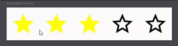
 var myRating by remember { mutableIntStateOf(3) }
    RatingBar(
        currentRating = myRating,
        onRatingChanged = { myRating = it }
    )
myRating – This variable stores and track the current rating value.

Style of Rating Bar
Let’s change the colour of the rating star with the optional parameter.
var myRating by remember { mutableIntStateOf(3) }
    RatingBar(
        currentRating = myRating,
        onRatingChanged = { myRating = it },
        starsColor = Color.Green
    )
Color.Magenta
Size of Rating Bar
Let’s change the size of the rating bar with a maxRating optional parameter.
var myRating by remember { mutableIntStateOf(5) }
    RatingBar(
        maxRating = 10,
        currentRating = myRating,
        onRatingChanged = { myRating = it }
    )
Some other Sizes
var myRating by remember { mutableIntStateOf(1) }
    RatingBar(
        maxRating = 3,
        currentRating = myRating,
        onRatingChanged = { myRating = it }
    )

Accessibility
In our rating bar function, contentDescription parameter value is null that not a good practice for your final application. Always use strings to describe the UI component so that the screen reader can read it for users with disabilities. Let’s make our rating bar accessible to users with disabilities.
contentDescription = "The current rating is $currentRating"Now, our code is good to go as it shows the current rating to the screen reader.
In this blog post, we have discussed the basic example of a rating bar. Now, you can further enhance and customize the rating bar to your specific requirements.
Some Useful Links
One thought on “Custom Rating Bar in Jetpack Compose: A Comprehensive Guide”