In modern Android app development, creating a seamless and intuitive user experience is paramount. One crucial component that contributes to this experience is the TopAppBar. In this blog post, we will delve into the world of Jetpack Compose and explore the capabilities and flexibility offered by the top app bar in creating stunning and functional user interfaces.
What is Top App Bar?
The top app bar is a fundamental UI element that resides at the top of the screen, providing users with quick access to essential features and navigation options. It typically contains a title, navigation icon, and various action items such as search, settings, or user profile icons.
There are four types of top app bars as per Material 3 guidelines.
- Centre-Aligned
- Small
- Medium
- Large
Creating a small TopAppBar
To create a top app bar in the jetpack compose, we will use TopAppBar composable function.
Note: By default, TopAppBar API makes the top bar width equal to the available width of the device.
Simple TopAppBar
Adding only text to the top app bar. A title parameter where you can pass a Text composable to display the title of your app.
TopAppBar(
        title = { Text(text = "Top Bar") }
    )
Adding Navigation Icon
The navigationIcon parameter allows you to specify a navigation icon, such as a menu or back arrow, which can be wrapped with an IconButton for handling click events.
 TopAppBar(
        title = { Text(text = "Top Bar") },
        navigationIcon = {
            IconButton(onClick = { /*TODO*/ }) {
                Icon(
                    imageVector = Icons.Default.ArrowBack,
                    contentDescription = null
                )
            }
        }
    )
Adding Action Items
To add action items to the top app bar, the actions parameter of TopAppBar accepts a composable lambda. Within this lambda, you can add multiple IconButton composables, each representing an action item. By providing an onClick lambda, you can define the action to be performed when the user interacts with the respective action item.
TopAppBar(
        title = { Text(text = "Top Bar") },
        navigationIcon = {...},
        actions = {
            IconButton(onClick = { /*TODO*/ }) {
                Icon(
                    imageVector = Icons.Default.DateRange,
                    contentDescription = null
                )
            }
            IconButton(onClick = { /*TODO*/ }) {
                Icon(
                    imageVector = Icons.Default.Settings,
                    contentDescription = null
                )
            }
        }
    )
Adding color to TopAppBar
To add color to the top app bar, we use the color parameter of TopAppBar API.
TopAppBar(
        title = { Text(text = "Top Bar") },
        navigationIcon = {...},
        actions = {...},
        colors = TopAppBarDefaults.smallTopAppBarColors(Color.Green)
    )
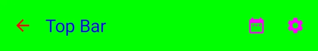
Note: Just passing single color to smallTopAppBarColors function will apply that color to the container of the top app bar. But if you want to manipulate every component of the top app bar then pass in optional parameters of smallTopAppBarColors function. Let’s take an example:
TopAppBar(
        title = { Text(text = "Top Bar") },
        navigationIcon = {...},
        actions = {...},
        colors = TopAppBarDefaults.smallTopAppBarColors(
            containerColor = Color.Green,
            titleContentColor = Color.Blue,
            navigationIconContentColor = Color.Red,
            actionIconContentColor = Color.Magenta
        )
    )
The name of the parameters is self-explanatory.
Note: As the parameters are the same for all four types of TopAppBar, we will just provide code and output images of the other top app bars.
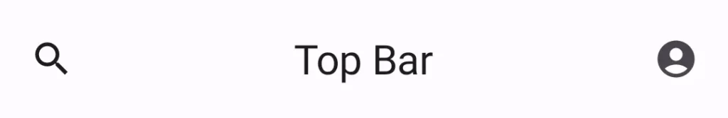
Centre-Aligned TopAppBar
 CenterAlignedTopAppBar(
        title = { Text(text = "Top Bar") },
        navigationIcon = {
            IconButton(onClick = { /*TODO*/ }) {
                Icon(
                    imageVector = Icons.Default.Search,
                    contentDescription = null
                )
            }
        },
        actions = {
            IconButton(onClick = { /*TODO*/ }) {
                Icon(
                    imageVector = Icons.Default.AccountCircle,
                    contentDescription = null
                )
            }
        }
    )
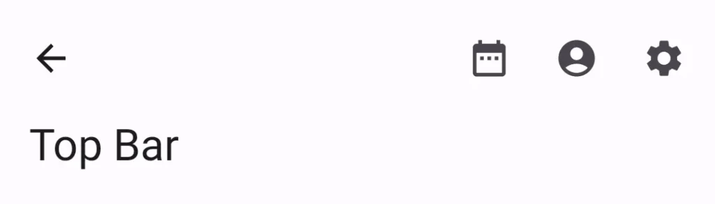
Medium TopAppBar
MediumTopAppBar(
        title = { Text(text = "Top Bar")},
        navigationIcon = {
            IconButton(onClick = { /*TODO*/ }) {
                Icon(
                    imageVector = Icons.Default.ArrowBack,
                    contentDescription = null
                )
            }
        },
        actions = {
            IconButton(onClick = { /*TODO*/ }) {
                Icon(
                    imageVector = Icons.Default.DateRange,
                    contentDescription = null
                )
            }
            IconButton(onClick = { /*TODO*/ }) {
                Icon(
                    imageVector = Icons.Default.AccountCircle,
                    contentDescription = null
                )
            }
            IconButton(onClick = { /*TODO*/ }) {
                Icon(
                    imageVector = Icons.Default.Settings,
                    contentDescription = null
                )
            }
        }
    )
Large TopAppBar
LargeTopAppBar(
        title = { Text(text = "Top Bar")},
        navigationIcon = {
            IconButton(onClick = { /*TODO*/ }) {
                Icon(
                    imageVector = Icons.Default.ArrowBack,
                    contentDescription = null
                )
            }
        },
        actions = {
            IconButton(onClick = { /*TODO*/ }) {
                Icon(
                    imageVector = Icons.Default.DateRange,
                    contentDescription = null
                )
            }
            IconButton(onClick = { /*TODO*/ }) {
                Icon(
                    imageVector = Icons.Default.AccountCircle,
                    contentDescription = null
                )
            }
            IconButton(onClick = { /*TODO*/ }) {
                Icon(
                    imageVector = Icons.Default.Settings,
                    contentDescription = null
                )
            }
        }
    )
Note: To use the top app bar in your app, you will use a scaffold layout. If you don’t know how to use scaffold then check out my previous post on Scaffold. Links are given below.
In this blog post, we have explored the basics of creating a top app bar in Jetpack Compose. By diving deeper into the available options, customizations, and advanced features, you can take full advantage of this powerful UI element and create stunning user interfaces for your Android apps.
Some Useful Links
Happy Coding 🙂