Jetpack Compose, the declarative UI toolkit from Google, has revolutionized Android app development by simplifying the creation of interactive and visually appealing user interfaces. One common UI element in many apps is the bottom bar, which provides easy navigation and access to key actions. In this blog post, we will explore how to create a bottom bar in Jetpack Compose, leveraging the power of its composability and flexibility.
Understanding BottomAppBar
Jetpack Compose offers the BottomAppBar component, a pre-built solution for implementing bottom bars in your app. With this BottomAppBar, you can achieve a material design-compliant bottom navigation experience effortlessly.
- The bottom app bar is easy to reach from a handheld position on a mobile device.
- A bottom app bar’s layout and actions change based on the needs of the screen
Note: In the jetpack compose, there are two types of bottom app bars. One supports a floating action button and the other doesn’t.
Bottom Bar
Within BottomAppBar, you can add various UI elements like icons, buttons, and menus as per your app’s requirements. For example, you can include a navigation icon to handle the primary app navigation, along with action icons for specific actions or features.
BottomAppBar{
        Row(
            modifier = Modifier.fillMaxWidth(),
            horizontalArrangement = Arrangement.SpaceEvenly
        ) {
            IconButton(onClick = { /*TODO*/ }) {
              Icon(imageVector = Icons.Default.Home, contentDescription = null)
            }
            IconButton(onClick = { /*TODO*/ }) {
              Icon(imageVector = Icons.Default.Favorite, contentDescription = null)
            }
        }
    }
Styling of Bottom Bar
You can customize the appearance of BottomAppBar by modifying its properties, such as the container color, content color etc.
BottomAppBar(
        containerColor = Color.Yellow,
        contentColor = Color.Red
    ){...}// code in curly brackets is same as above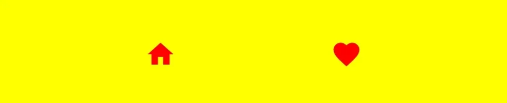
containerColor – This parameter sets the color to the background of the bottom app bar.
contentColor – And this one is for the elements on the bottom app bar.
Note: In the Material 3 library, the container color for all the UI elements is taken from the default color. For example, in the bottom app bar containerColor is set from BottomAppBarDefaults.containerColor and the same as for contentColor.
Note: If you want to have no color to the bottom app bar then prefer using Color.Transparent as a value to containerColor parameter.
Tonal Elevation
This parameter of BottomAppBar provides a translucent primary color overlay on the top of the container when contianerColor is ColorScheme.surface. A higher tonal elevation value will result in a darker color in a light theme and lighter color in a dark theme.
BottomAppBar(
        tonalElevation = 16.dp
    ){...}
BottomAppBar(
tonalElevation = 48.dp
){...}

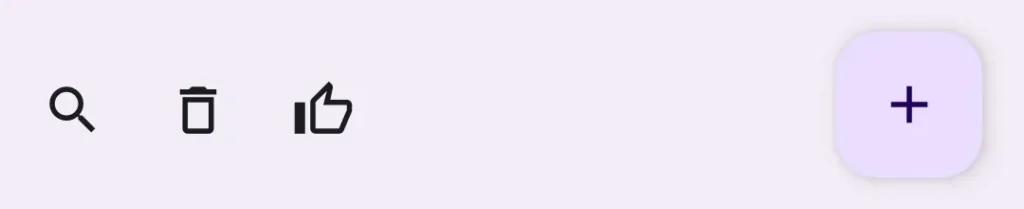
Bottom Bar with Floating Action Button
 BottomAppBar(
        actions = {
            IconButton(onClick = { /*TODO*/ }) {
               Icon(imageVector = Icons.Outlined.Search, contentDescription = null)
            }
            IconButton(onClick = { /*TODO*/ }) {
               Icon(imageVector = Icons.Outlined.Delete, contentDescription = null)
            }
            IconButton(onClick = { /*TODO*/ }) {
               Icon(imageVector = Icons.Outlined.ThumbUp, contentDescription = null)
            }
        },
        floatingActionButton = {
            FloatingActionButton(onClick = { /*TODO*/ }) {
               IconButton(onClick = { /*TODO*/ }) {
                    Icon(imageVector = Icons.Default.Add, contentDescription = null)
                }
            }
        }
    )
Note: To add the bottom bar to your app, you will use the scaffold layout. If you don’t know how to use scaffold layout then check out my previous post on Scaffold. Links are given below.
In this blog post, we explored how to create a bottom bar in Jetpack Compose using the BottomAppBar component. Implementing a bottom bar using Jetpack Compose not only enhances the user experience but also aligns with the latest design guidelines, ensuring your app feels native and familiar to users. So, go ahead and give it a try in your next project, and take advantage of the power and simplicity of Jetpack Compose!
Useful Links
Happy Coding 🙂