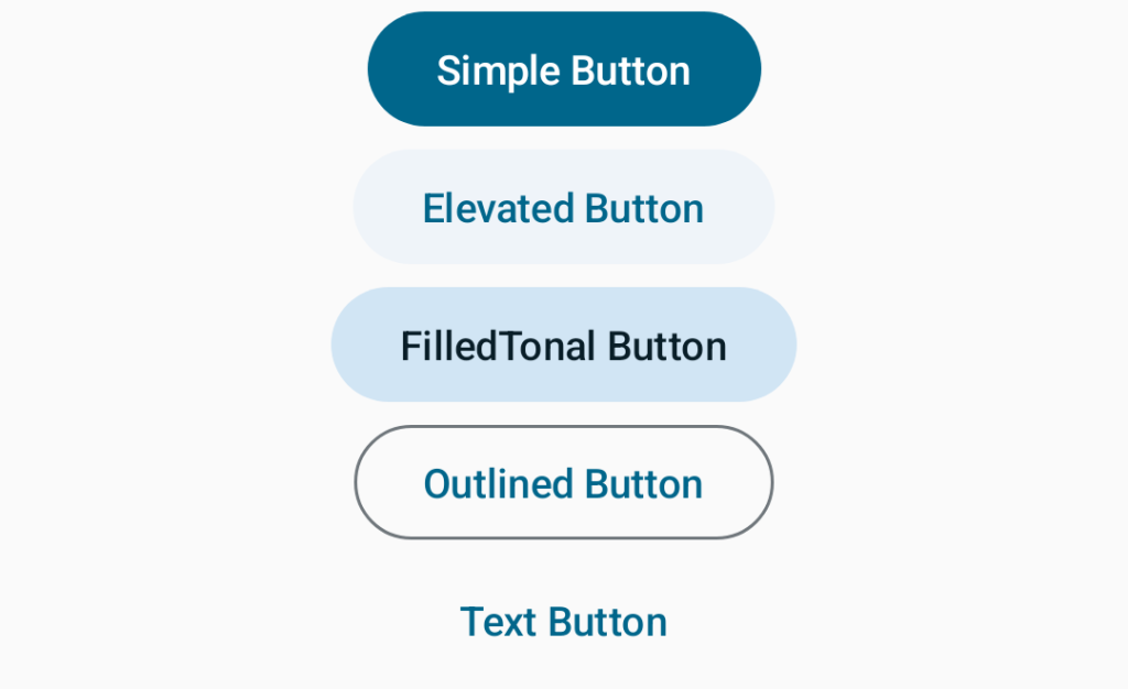
Buttons are a very important part of UI and there is no component that can fulfill the functions of buttons. Buttons in jetpack compose are of mainly 5 types:
- Simple Button
- Elevated Button
- Filled Tonal Button
- Outlined Button
- Text Button
The button takes many parameters but all are optional except two. And we can say that there are two parameters in the Button function that will be implemented every time we call the Button function. One is onClick a callback and the other is content a parameter that takes any composable function. Examples of different Buttons with code and output.
 Button(onClick = { }) {
            Text(text = "Simple Button")
        }

        ElevatedButton(onClick = { }) {
            Text(text = "Elevated Button")
        }

        FilledTonalButton(onClick = { }) {
            Text(text = "FilledTonal Button")
        }

        OutlinedButton(onClick = { }) {
            Text(text = "Outlined Button")
        }

        TextButton(onClick = { }) {
            Text(text = "Text Button")
        }
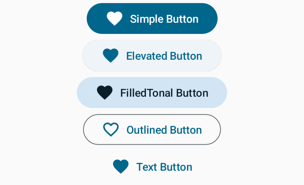
The last parameter of every Button composable function is a composable function with RowScope which means anything in the lambda will be placed in Row that is a layout of jetpack compose that put its children horizontally. It means we can put any number of composable means icons, images etc. supported to the Button. Let’s modify the above code to have an Icon before the tag on the Button.
Button(onClick = { }) {
            Icon(
                imageVector = Icons.Filled.Favorite,
                contentDescription = null,
                modifier = Modifier.padding(end = 8.dp)
            )
            Text(text = "Simple Button")
        }

        ElevatedButton(onClick = { }) {
            Icon(
                imageVector = Icons.Filled.Favorite,
                contentDescription = null,
                modifier = Modifier.padding(end = 8.dp)
            )
            Text(text = "Elevated Button")
        }

        FilledTonalButton(onClick = { }) {
            Icon(
                imageVector = Icons.Filled.Favorite,
                contentDescription = null,
                modifier = Modifier.padding(end = 8.dp)
            )
            Text(text = "FilledTonal Button")
        }

        OutlinedButton(onClick = { }) {
            Icon(
                imageVector = Icons.Outlined.FavoriteBorder,
                contentDescription = null,
                modifier = Modifier.padding(end = 8.dp)
            )
            Text(text = "Outlined Button")
        }

        TextButton(onClick = { }) {
            Icon(
                imageVector = Icons.Filled.Favorite,
                contentDescription = null,
                modifier = Modifier.padding(end = 8.dp)
            )
            Text(text = "Text Button")
        }
Well missed some type of button, let’s see them now:
FilledTonalIconButton
FilledTonalIconButton(onClick = {}) {
            Icon(imageVector = Icons.Outlined.FavoriteBorder, contentDescription = null)
        }
IconButton
IconButton(onClick = { /*TODO*/ }) {
        Icon(imageVector = Icons.Default.AccountBox, contentDescription = null)
    }
Styling of Button
Well for the purpose of styling buttons in jetpack compose, we will mainly focus on three parameters of Button composable function named as shape, colors and border. And don’t forget, you can provide modifier to any composable function
shape – defines the shape of this button’s container, border (when the border is not null), and shadow (when using elevation).
colors – It is of a type ButtonColors that will be used to resolve the colours for this button in different states.
border – it defines the border to draw around the container of this button.
Let’s see through examples: –
 Button(
            onClick = {},
            shape = RoundedCornerShape(30.dp),
            colors = ButtonDefaults.buttonColors(
                containerColor = Color.Cyan,
                contentColor = Color.Blue
            ),
            border = BorderStroke(2.dp, Color.Magenta)
        ) {
            Text(text = "Button")
        }
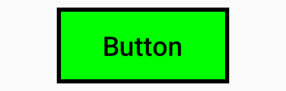
Button(
            onClick = {},
            shape = RectangleShape,
            colors = ButtonDefaults.buttonColors(
                containerColor = Color.Green,
                contentColor = Color.Black
            ),
            border = BorderStroke(2.dp, Color.Black)
        ) {
            Text(text = "Button")
        }
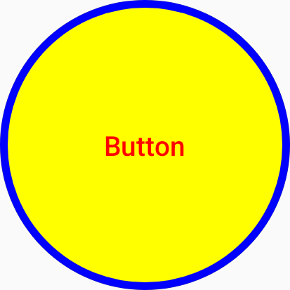
 Button(
            onClick = {},
            shape = CircleShape,
            colors = ButtonDefaults.buttonColors(
                containerColor = Color.Yellow,
                contentColor = Color.Red
            ),
            border = BorderStroke(4.dp, Color.Blue),
            modifier = Modifier.size(150.dp)
        ) {
            Text(text = "Button")
        }
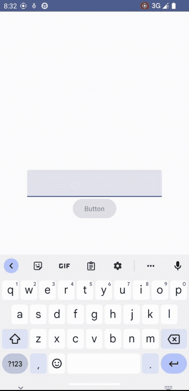
Enabling and Disabling of Button
The button in jetpack compose has a parameter named enabled which controls the enabled state of the button. When false, it will not respond to user input, and it will appear visually disabled and disabled to accessibility services as well. Let’s have an example to explain this feature of the button.
@Composable
fun ButtonState(modifier: Modifier = Modifier) {
    val context = LocalContext.current
    var enteredValue by remember {
        mutableStateOf("")
    }
    Column(
        horizontalAlignment = Alignment.CenterHorizontally,
        verticalArrangement = Arrangement.Center
    ) {
        TextField(value = enteredValue, onValueChange = { enteredValue = it })
        Button(
            onClick = {
                Toast.makeText(context, "Yay", Toast.LENGTH_SHORT).show()
            },
            enabled = enteredValue.isNotEmpty()
        ) {
            Text(text = "Button")
        }
    }
}
Let’s decode the above-written code. It’s a composable function named ButtonState taking a modifier as a parameter. In the function, we make reference to the local context using LocalContext.Current then we created a variable named enteredValue of type String using remember and mutableStateOf. I know, if you are a beginner then remember, mutableStateOf and TextField may be new to you, for now just ignore them, we will take care of them in upcoming posts.
Now, we created a column which is of layout type in jetpack and then some parameters to it. Now we created a TextField which is an input taker. If you see enteredValue variable it’s initially set to an empty string but when the user starts typing TextField sets the value to enteredValue variable and now it is not empty. And in the button’s enabled parameter we checked, enteredValue variable is empty or not with isNotEmpty function which returns a boolean. If the variable is empty, it returns true otherwise false. And boolean value is directly set to enabled parameter that changes button’s visible state.
That’s all for the Button composable function as it was just a beginner’s guide but there are many more possibilities to explore with a button. I am sure there will be other ways to do the same thing and it’s up to you how you do it. Thanks for visiting jetpackcomposeworld.com. And make sure to visit the reference page of Button.
One thought on “Jetpack Compose Button”