TextField in the Jetpack Compose allows users to enter and modify the text in UI. There are two levels of TextField implementation in jetpack compose.
- TextField is the Material Design implementation. As per Android recommendation, we should choose material design guidelines. And this is two types of names as
Filled TextFieldwhich is the default one andOutlinedTextField. - BasicTextField enables users to edit text via hardware or software keyboard but provides no decorations like hints or placeholders.
And in this post, we only focus on TextField and its parameters, not on BasicTextField. And in the end, we will take a few examples of styling a text field.
Basic TextField
TextField(value = "", onValueChange = {})
OutlinedTextField(value = "", onValueChange = {})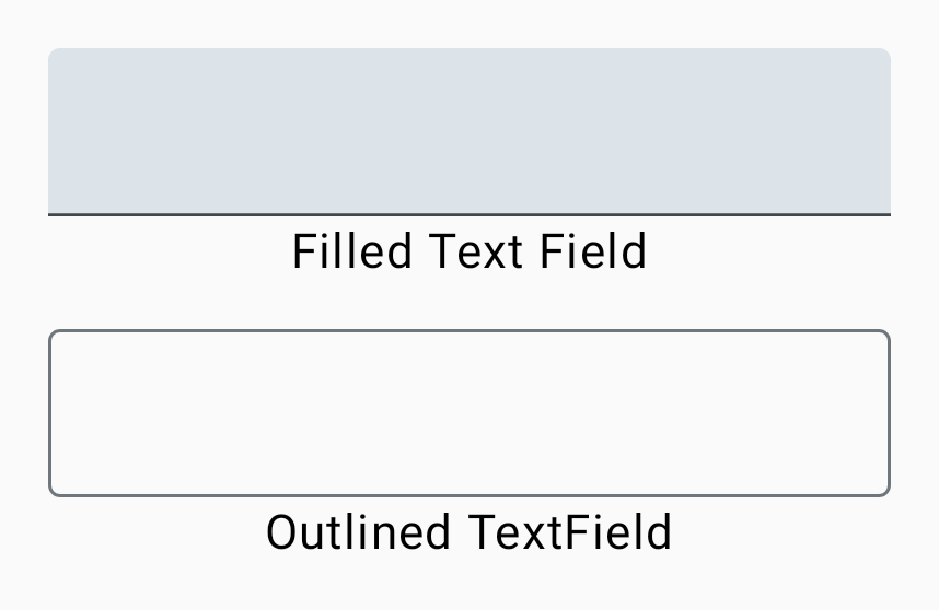
In the above code, textfield takes two compulsory parameters. Value takes a string that is to be shown in the text field and onValueChange parameter is a callback that is triggered when the input service updates the text. An updated text comes as a parameter of the callback.
Composable function as a parameter in TextField
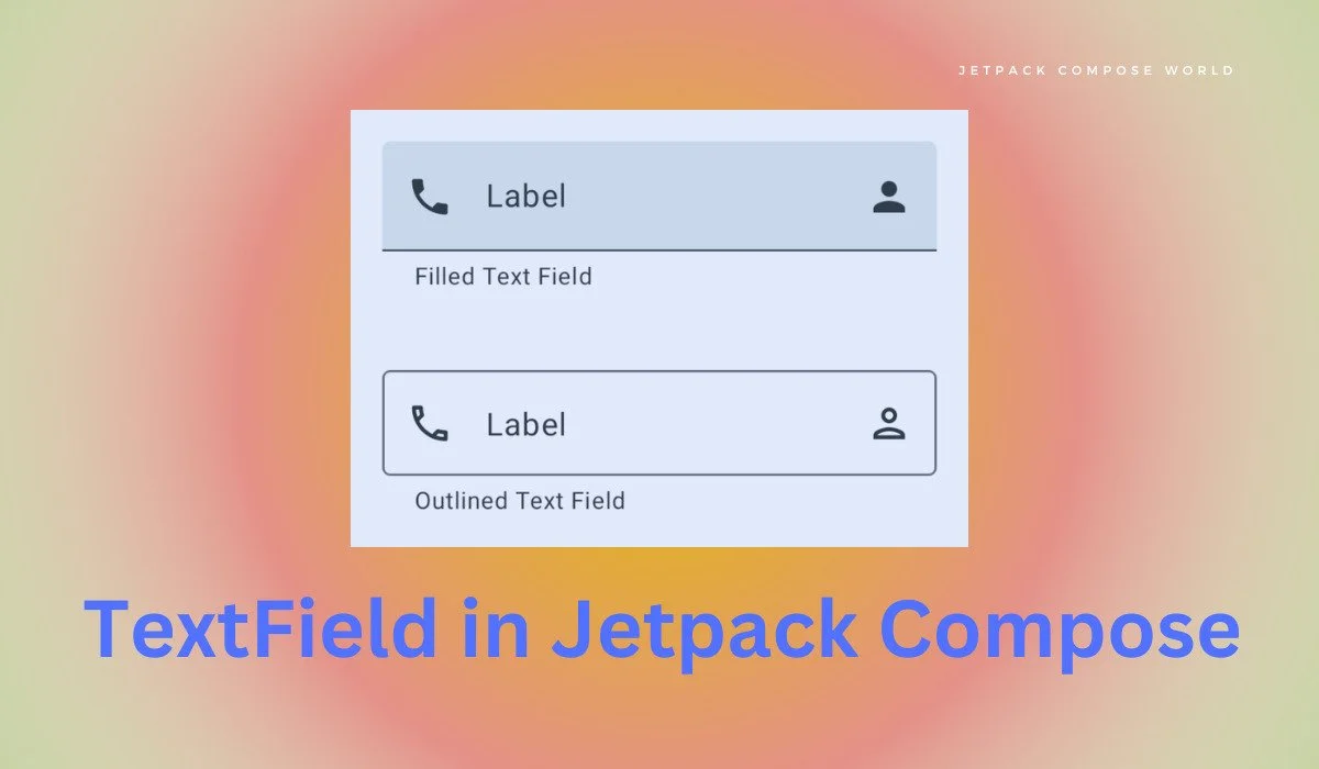
 TextField(
            value = "",
            onValueChange = {},
            label = { Text(text = "Label") },
            placeholder = { Text(text = "Placeholder") },
            leadingIcon = { Icon(imageVector = Icons.Filled.Phone, contentDescription = null) },
            trailingIcon = { Icon(imageVector = Icons.Filled.Person, contentDescription = null) },
            supportingText = { Text(text = "Filled Text Field") }
        )
        OutlinedTextField(
            value = "",
            onValueChange = {},
            label = { Text(text = "Label") },
            placeholder = { Text(text = "Placeholder") },
            leadingIcon = { Icon(imageVector = Icons.Outlined.Phone, contentDescription = null) },
            trailingIcon = { Icon(imageVector = Icons.Outlined.Person, contentDescription = null) },
            supportingText = { Text(text = "Outlined Text Field") }
        )
label – It is an optional text that is displayed inside the text field container.
placeholder – It is also an optional text that is displayed inside textfield when textField is in focus.
leading icon – icon at the beginning of the textfield
trailing icon – icon displayed at the end of textfield
supporting text – text displayed below the text field
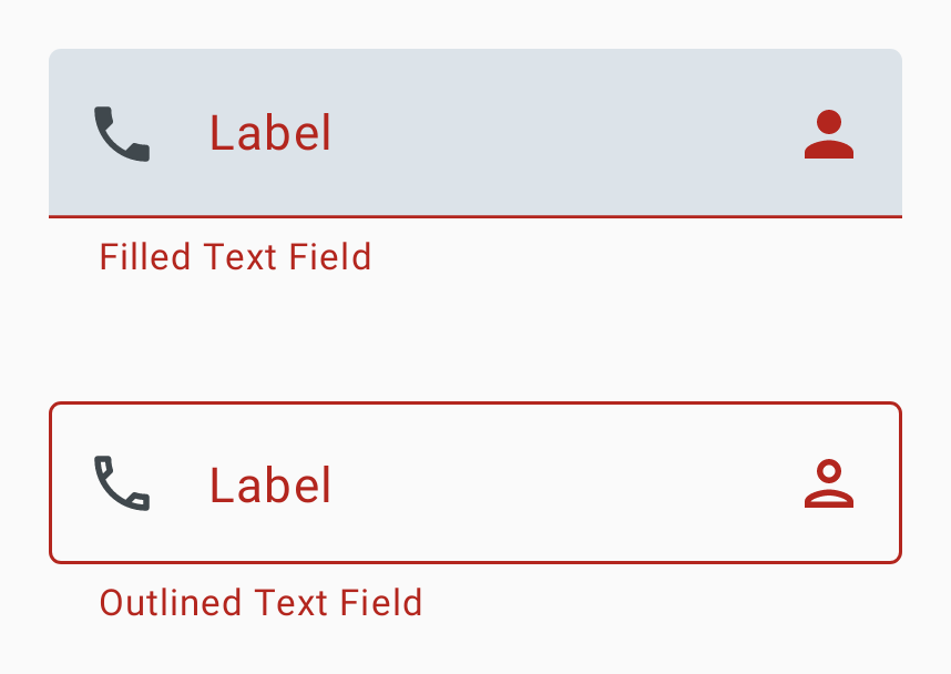
isError parameter of TextField
It indicates if the text field’s current value is in error. If set to true, the label, bottom indicator and trailing icon by default will be displayed in error colour.
 TextField(
            value = "",
            onValueChange = {},
            label = { Text(text = "Label") },
            placeholder = { Text(text = "Placeholder") },
            leadingIcon = { Icon(imageVector = Icons.Filled.Phone, contentDescription = null) },
            trailingIcon = { Icon(imageVector = Icons.Filled.Person, contentDescription = null) },
            supportingText = { Text(text = "Filled Text Field") },
            isError = true
        )
        OutlinedTextField(
            value = "",
            onValueChange = {},
            label = { Text(text = "Label") },
            placeholder = { Text(text = "Placeholder") },
            leadingIcon = { Icon(imageVector = Icons.Outlined.Phone, contentDescription = null) },
            trailingIcon = { Icon(imageVector = Icons.Outlined.Person, contentDescription = null) },
            supportingText = { Text(text = "Outlined Text Field") },
            isError = true
        )
Single line and Max lines
The single line parameter is of type Boolean when it’s true textfield becomes a single horizontal scrolling text field. And Max lines parameter is of type Int and it describes maximum height in terms of the maximum number of visible lines. It should be equal to or greater than 1. Note that this parameter will be ignored and max lines will be set to 1 when single line parameter is set to true.
 var enteredValue by remember {
 mutableStateOf("")
 }
TextField(
            value = enteredValue,
            onValueChange = {enteredValue = it},
            label = { Text(text = "Label") },
            supportingText = { Text(text = "Filled Text Field") },
            maxLines = 2
        )
        OutlinedTextField(
            value = enteredValue,
            onValueChange = {enteredValue = it},
            label = { Text(text = "Label") },
            supportingText = { Text(text = "Outlined Text Field") },
            maxLines = 2
        )
Enabled and read-only parameters
Enabled controls the enabled state of the textfield. When false, the textfield will not respond to user input and it will appear visually disabled and disabled to accessibility services. And readOnly parameter controls the editable state of the textfield. When true, textfield can’t be modified. However, a user can focus on it and copy text from it. Read-only textfields are usually used to display pre-filled forms that a user can’t edit.
 TextField(
            value = enteredValue,
            onValueChange = { enteredValue = it },
            label = { Text(text = "Label") },
            supportingText = { Text(text = "Filled Text Field") },
            enabled = false
        )
Styling of TextField in Jetpack Compose
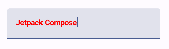
Text Style
It applies the style to text in the textfield.
Visual Transformation and Keyboard Options
The visual transformation parameter applies to the input value in the text field and it replaces the input value with * for passwords and inserts hyphens every 4 digits for a credit card number. But there is some limitation of the visual transformation parameter, it only hides the input value in the textfield, not on the keyboard suggestion box. And keyboard options hide text from the suggestion box in case of a password and provide different styles of the keyboard as per the need of the developer. Let’s see through examples:
var enteredValue by remember { mutableStateOf("") }
      TextField(
            value = enteredValue,
            onValueChange = { enteredValue = it },
            visualTransformation = PasswordVisualTransformation()
        )
The above code block only uses visual transformation which only hides input value in the textfield not in the keyboard suggestion box. Now let’s take another example with keyboard options parameter:
var enteredValue by remember { mutableStateOf("") }
        TextField(
            value = enteredValue,
            onValueChange = { enteredValue = it },
            visualTransformation = PasswordVisualTransformation(),
            keyboardOptions = KeyboardOptions(
                keyboardType = KeyboardType.Password
            )
        )
Exploring Keyboard Options
Keyboard Options takes four parameters, we discuss only three of them here and examples are shown in the video below.
- capitalization – It informs the keyboard whether to automatically capitalize characters, words or sentences. It only applies to text-based keyboard type like
KeyboardType.Textand doesn’t apply toKeyboardType.Number - autoCorrect – It informs the keyboard whether to enable auto-correct or not.
- keyboardType – Keyboard type is used in the
textfield.
Jetpack Compose TextField Keyboard Options Video
textFieldThanks for visiting this post, I hope the content is helpful.
One thought on “Jetpack Compose TextField”