Jetpack Compose has gained significant attention for its simplicity and declarative approach to building user interfaces. One of the essential components in creating intuitive and interactive UI experiences is tooltips. Tooltips provide contextual information and hints to users, making the app more user-friendly. In this blog post, we’ll explore tooltips in Jetpack Compose, learn how to implement them and discover best practices to make your tooltips shine.
What are tooltips?
Tooltips are small overlay views that appear when users interact with specific UI elements. They typically contain concise information, explanatory text, or additional context related to the UI element.
In jetpack compose, there are two types of tooltips.
- Plain tooltip
- Rich tooltip
Best Practices for Using Tooltips:
- Keep it concise: Tooltips should provide brief and clear information. Avoid overwhelming users with excessive text or complex explanations.
- Contextual relevance: Ensure the tooltip content is relevant and meaningful to the UI element it accompanies. Make sure it adds value to the user’s understanding or interaction.
- Trigger sensitivity: Consider the sensitivity of the trigger that displays the tooltip. Ensure tooltips only appear when users genuinely need additional information or guidance.
- Accessibility: Make tooltips accessible by ensuring that they can be triggered with both touch and keyboard interactions. Also, provide an alternative mechanism for users who rely on screen readers to access the tooltip’s information.
Prerequisites
To use the tooltips in your projects, update the Material 3 library to the latest version in your build.gradle file at the app level. Currently, we are using 1.2.0-alpha03
implementation 'androidx.compose.material3:material3-android:1.2.0-alpha03'Plain Tooltip
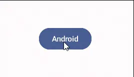
It provides a descriptive message for an anchor and is invoked when the anchor is long-pressed. PlainTooltipBox is a composable function in Jetpack Compose that provides a way to implement a plain tooltip. Let’s see how:
PlainTooltipBox(
            tooltip = { Text(text = "Yes, I am a tooltip") }
        ) {
            Button(
                onClick = {},
                modifier = Modifier.tooltipTrigger()
            ) {
                Text(text = "Android")
            }
        }
In the above code, we provide a text composable as a tooltip (we can provide any composable type) and in the lambda, we provide over the anchor to which we want to attach this tooltip.
Modifier.tooltipTrigger() – It appends a long click to the composable that this modifier is chained with.
Output:
Note: By default, the tooltip shows when we long press an anchor. If you want to control when to show a tooltip, see the below example:
Control State of Plain Tootip
First of all, we create two variables myTooltipState and scope, with the former variable, we create and remember a PlainTooltipState and with the latter variable, we create a coroutine scope bound to our current composition. The scope will be cancelled when this call leaves the composition.
val myTooltipState = rememberPlainTooltipState()
val scope = rememberCoroutineScope()
Now, we simply call the PlainTooltipBox function with the parameters.
Column(
        horizontalAlignment = Alignment.CenterHorizontally
        ) {
     PlainTooltipBox(
            tooltip = { Text("Add to Favorites") },
            tooltipState = myTooltipState
        ) {
           Icon(
                imageVector = Icons.Filled.FavoriteBorder,
                contentDescription = null
            )
          }
      OutlinedButton(
           onClick = { scope.launch { myTooltipState.show() } }
       ) {
           Text("Display tooltip")
         }
  }
In the above code, we simply provide tooltip and tooltipState parameters and then in our OutlinedButton, we call the tooltip to show within our coroutine scope.
Note: As we are controlling the state of the tooltip, we don’t have to long press just simply click to show the tooltip.
Output:

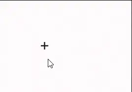
Rich Tooltip
With this tooltip, we can pass in a title, text and action also. This tooltip is also invoked when we long press an anchor. Let’s take an example.
RichTooltipBox(
            text = { Text(text = "I am a tooltip.") }
        ) {
            IconButton(
                onClick = {},
                modifier = Modifier.tooltipTrigger()
            ) {
                Icon(
                      imageVector = Icons.Filled.Add,
                      contentDescription = null
                 )
            }
        }
In the above code, only the function invocation is different (RichTooltipBox instead of PlainTooltipBox) and all the parameters are the same.
Output:
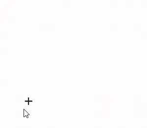
Now, let’s explore the beauty of the Rich Tooltip. With a Rich tooltip, we can make the tooltip persistent and customize it as well. Let’s see how:
val myTooltipState = rememberRichTooltipState(isPersistent = true)
val scope = rememberCoroutineScope()
    RichTooltipBox(
            title = { Text(text = "Add") },
            action = {
                TextButton(onClick = { scope.launch { myTooltipState.dismiss() } }
                ) {
                    Text(text = "Dismiss")
                }
            },
            text = { Text(text = "Add things to the List") },
            tooltipState = myTooltipState
        ) {
            IconButton(
                onClick = {},
                modifier = Modifier.tooltipTrigger()
            ) {
                Icon(imageVector = Icons.Filled.Add, contentDescription = null)
            }
        }
myTooltipState – This variable holds the tooltip state through configuration and makes the tooltip persistent when we set it to true.
title – It is the title or heading of the tooltip
action – We describe an action to dismiss the tooltip when we click this text button.
Output:
As you can see in the above gif, we can dismiss our persistent tooltip by clicking on the text button or if we don’t provide an action then by clicking anywhere outside the tooltip box.
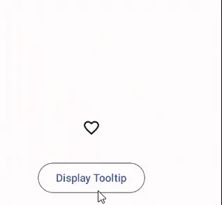
Control State of Rich Tooltip
By controlling the state of the rich tooltip, we can use any UI component to show the tooltip instead of long pressing an anchor to which the tooltip is attached. Let’s take an example:
val myTooltipState = rememberRichTooltipState(isPersistent = true)
val scope = rememberCoroutineScope()
        Column(
            horizontalAlignment = Alignment.CenterHorizontally
        ) {
            RichTooltipBox(
                title = { Text(text = "Favorite") },
                action = {
                    TextButton(
                        onClick = { scope.launch { myTooltipState.dismiss() } }
                    ) {
                        Text(text = "Dismiss")
                    }
                },
                text = { Text(text = "Add to Favorites") },
                tooltipState = myTooltipState
            ) {
                Icon(
                    imageVector = Icons.Filled.FavoriteBorder,
                    contentDescription = null
                )
            }
            Spacer(modifier = Modifier.requiredHeight(30.dp))
            OutlinedButton(
                onClick = { scope.launch { myTooltipState.show() } }
            ) {
                Text(text = "Display Tooltip")
            }
        }
There is nothing new here if you understand the state control of the plain tooltip then you will understand this one as well, as the code is the same.
Output:
We can customize the colour and shape of the tooltips. We will discuss them in this post. I will come up with another post that will focus on the styling of the tooltips.
Happy Composing 🙂
Radio Button in Jetpack Compose
One thought on “Jetpack Compose Tooltips”