Progress Indicator is a jetpack compose component that tells the user about the ongoing process such as downloading, uploading, API calls, verifying etc. In view-based UI development, the progress indicator is known as ProgressBar.
In jetpack compose, there are two types of progress indicators:
- Linear
- Circular

Both linear and circular progress indicators have two modes.
- Indeterminate – is used when you don’t know how long your process will take.
- Determinate – is used when you want to show that a specific quantity of progress has occurred—for example, the per cent remaining of a file you are downloading.
Important Takeaways
- Never use progress indicators for decorative purposes.
- Progress indicators should be applied to all instances of a process in a consistent format (linear or circular).
1. Linear Progress Indicator
This progress indicator displays progress in a straight line.
1. Indeterminate Progress Indicator
It is used to display progress where you don’t know how long an action will take. To use this type of indicator in jetpack compose just call it by name, see in example:
LinearProgressIndicator()
2. Determinate Progress Indicator
This type of progress indicator is used when we want to show a specific amount of data that has been processed like 50 % of a file is downloaded. To use this, pass a float value as a parameter within a range of 0 to 1.
LinearProgressIndicator(.3f)
The above progress indicator shows 30 % of the total process has been completed.
2. Circular Progress Indicator
This progress indicator displays progress in a circular way.
1. Indeterminate Progress Indicator
CircularProgressIndicator()
2. Determinate Progress Indicator
CircularProgressIndicator(.6f)
Note: By default, all the determinate progress indicators in jetpack compose will note animate.
Animation
In this section, we will provide animation to determinate progress indicators.
val progressValue = .6f
val infiniteTransition = rememberInfiniteTransition()
val progressAnimationValue by infiniteTransition.animateFloat(
        initialValue = .0f,
        targetValue = progressValue,
        animationSpec = infiniteRepeatable(animation = tween(900))

LinearProgressIndicator(progressAnimationValue)
CircularProgressIndicator(progressAnimationValue)
progressValue –This value defines how much progress has finished.
rememberInfiniteTransition() – It creates an InfiniteTransition that runs infinite child animations.
initialValue – This value is the starting value for the animation while using animateFloat().
targetValue – It is the same as progressValue and it keeps changing.
tween(900) – Creates a TweenSpec configured with the given duration, delay and easing curve.
Note: If initialValue or targetValue is changed at any point during the animation, the animation will be restarted with the new initialValue and targetValue. Note: this means continuity will not be preserved.
Note: We will see animation in detail in the chapter on animation.

Styling of Progress Indicators
In this section, we will use modifiers and other parameters to style the progress indicators.
LinearProgressIndicator(
                color = Color.Green,
                trackColor = Color.Magenta
            )
LinearProgressIndicator(
                progressAnimationValue,
                color = Color.Green,
                trackColor = Color.Magenta
            )
CircularProgressIndicator(
                color = Color.Green,
                modifier = Modifier.size(100.dp),
                strokeWidth = 8.dp
            )
CircularProgressIndicator(
                progressAnimationValue,
                color = Color.Green,
                modifier = Modifier.size(100.dp),
                strokeWidth = 8.dp
            )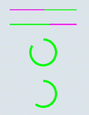
color – It is the colour of the progress indicator.
trackColor – The trackColor parameter refers to the colour of the path of the progress indicator and it is not available in the circular progress indicator.
Modifier.size(100.dp) – The size modifier increases the size of the progress indicator.
strokeWidth – This parameter defines the width of the progress indicator.
Note: For this progressAnimateValue, refer to this code.
Well, that’s all for the Jetpack Compose Progress Indicator. I hope the content is helpful. Some useful links are given below.