A card in jetpack compose is a component that displays its content on a raised surface. By default, a card in Jetpack Compose has ColumnScope. It means all the elements in the card composable function will be placed as per the column layout.
Note: we use the Material 3 library in all the posts. To use Material 3 in your projects paste the below code to your build.gradle in Module:app then sync
implementation 'androidx.compose.material3:material3'As per Android’s Material 3 website, a card is of three types in jetpack compose.
- Filled Card
- Elevated Card
- Outlined Card
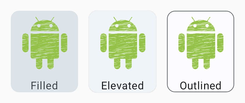
A card is a single unit containing one or more elements. It can hold anything like images, text, buttons, lists and other components of the jetpack compose as well. A card’s layout and dimensions depend on its contents.
Note: We will be using the same code in all three card types so that differences can stand out easily.
Card Types
1. Filled Card
It is the default card in the jetpack compose.
1. Simple Filled Card
Card(modifier = Modifier.padding(8.dp)) {
        Text(text = "First Item")
        Text(text = "Second Item")
    }
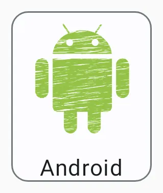
2. Filled Card with Image
Card(modifier = Modifier.padding(8.dp)) {
        Column(horizontalAlignment = Alignment.CenterHorizontally) {
            Image(
                painter = painterResource(id = R.drawable.android),
                contentDescription = "android image",
                modifier = Modifier.size(100.dp)
            )
            Text(text = "Android")
        }
    }
Alignment.CenterHorizontally – It aligns both image and text elements in the centre of the card horizontally.
Modifier.size(100.dp) – The size modifier makes the image size 100 dp.
Modifier.padding(8.dp) – This modifier creates a space of 8 dp around the card element.
Note: Never hard code strings in your code. Always store your strings in the strings.xml file at /res/values.
2. Elevated Card
This type of card contains a drop shadow which provides more separation from the background than filled cards but less than outlined cards.
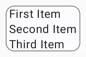
1. Simple Elevated Card
ElevatedCard(modifier = Modifier.padding(8.dp)) {
        Text(text = " First Item ")
        Text(text = " Second Item ")
        Text(text = " Third Item ")
    }
2 Elevated Card with Image
ElevatedCard(modifier = Modifier.padding(8.dp)) {
        Column(horizontalAlignment = Alignment.CenterHorizontally) {
            Image(
                painter = painterResource(id = R.drawable.android),
                contentDescription = "android image",
                modifier = Modifier.size(100.dp)
            )
            Text(text = "Android")
        }
    }
The code for both cards is the same instead of function invocation. So there is no need to explain the code again and again.
3. Outlined Card
This type of card contains a visual boundary around the container.
1. Simple Outlined Card
OutlinedCard(modifier = Modifier.padding(8.dp)) {
        Text(text = " First Item ")
        Text(text = " Second Item ")
        Text(text = " Third Item ")
    }
2. Outlined Card with Image
OutlinedCard(modifier = Modifier.padding(8.dp)) {
        Column(horizontalAlignment = Alignment.CenterHorizontally) {
            Image(
                painter = painterResource(id = R.drawable.android),
                contentDescription = "android image",
                modifier = Modifier.size(100.dp)
            )
            Text(text = "Android")
        }
    }
Styling of Card
Note: In this section, we will style only one type of card because the process of styling all cards is the same. Because all the card elements take the same parameters.
1. Shape
We can change the shape of the card background. By default, it takes CornerMedium shape which is provided by CardTokens ( Rectangle Shape ). For now ignore the last line and how the Material 3 theme works, we will discuss it in later posts.
- Circle Shape
- Rectangle Shape
- Cut Corner Shape
- Round Corner Shape
1. Circle Shape
Card(modifier = Modifier.padding(8.dp), shape = CircleShape) {
            Column(
                verticalArrangement = Arrangement.Center,
                horizontalAlignment = Alignment.CenterHorizontally,
                modifier = Modifier.size(200.dp)
            ) {
                // all the code is same as above
            }
        }
To achieve a circle shape, just pass the shape parameter to Card with CirclShape value. And all the remaining code is the same as used in the above examples.
verticalArrangement – It places the content of the column in the centre vertically.
horizontalAlignment – This places the content of the column in the centre horizontally.
size(200.dp) – The size modifier makes the column side to be fixed at 200 dp.
2. Cut Corner Shaper
 Card(modifier = Modifier.padding(8.dp), shape = CutCornerShape(32.dp)) {
           // all the code is same as above
        }
3. Round Corner Shape
Card(modifier = Modifier.padding(8.dp), shape = RoundedCornerShape(48.dp)) {
                      // all the code is same as above
        }
2. Elevation
The card elevation creates a shadow with a given dp value. In the below code, we have provided a parameter of type elevation to Card with a value of 16 dp. It cast a shadow around the card.
Card(
      modifier = Modifier.padding(8.dp),
      elevation = CardDefaults.cardElevation(16.dp)
     ) {
      // all the code is same as "Filled Card with Image"
     }
3. Border
This parameter of the card component draws a border around the container of the card. We need to pass a BorderStroke to set border property. BorderStroke has two parameters, the first one for the width of the border and the second one for the color of the border. Let’s take an example:
 Card(
       modifier = Modifier.padding(8.dp),
       border = BorderStroke(2.dp, Color.Green)
       ) {
       // all the code is same as "Filled Card with Image"
       }
4. Color
As the name suggests, this parameter of the card component sets the color of the card container.
Card(
      modifier = Modifier.padding(8.dp),
      colors = CardDefaults.cardColors(Color.Red)
      ) {
      // all the code is same as "Filled Card with Image"
      }
Clickable Card
We can make our card responsive by using clickable() modifier. Let’s take an example:
Card(
    modifier = Modifier.padding(8.dp).clickable
              {
               // code be excecuted on click goes here
              }
)
Note: Complete code for the above gif is available here.
Well, that’s all for the jetpack compose cards. I hope the content is useful.
3 thoughts on “Jetpack Compose Card”