User interfaces are an integral part of any application, and creating interactive and user-friendly interfaces is crucial for a successful user experience. Jetpack Compose, a modern UI toolkit for Android development, offers a wide range of powerful components to build dynamic user interfaces. Among these components, checkboxes play a vital role in capturing user input and enabling multiple selections. In this blog post, we will delve into the world of checkboxes in Jetpack Compose and explore their features and usage.
What are checkboxes?
Checkboxes are UI elements that allow users to make multiple selections from a set of options. Each checkbox represents a single option, and users can toggle their selection by tapping on the checkbox. The selected state of the checkbox is visually indicated by a checkmark or a filled box.
Creating a Checkbox:
In Jetpack Compose, creating a checkbox is as simple as invoking the Checkbox composable function. Firstly we create a variable that will hold the current state of the checkbox.
var myState by remember { mutableStateOf(false) }Note: Creating a variable using remember API and mutableStateOf helps the variable to survive the recomposition and configuration changes.
Now, we create a checkbox using Checkbox API of the jetpack compose.
 Checkbox(
        checked = myState,
        onCheckedChange = { myState = it }
)checked: This parameter states whether the checkbox is checked or unchecked.
onCheckedChange – If null, then the checkbox will not be interactable.
The Checkbox composable takes two important parameters: checked and onCheckedChange. The checked parameter represents the current checked state of the checkbox, while onCheckedChange is a callback that gets triggered when the checkbox’s state changes. By updating the myState value inside the onCheckedChange callback, we ensure that the checkbox reflects the correct state.

Disable Checkbox
The jetpack compose checkbox function takes a enabled parameter that controls the enabled state of the checkbox. When false, it will not respond to user input, and it will appear visually disabled and disabled to accessibility services.
Checkbox(
        checked = myState,
        onCheckedChange = { myState = it },
        enabled = false
    )
Styling of Checkboxes
A parameter named colors of the Checkbox function allow us to change the color of the checkbox. Let’s take an example:
Checkbox(
        checked = myState,
        onCheckedChange = { myState = it },
        colors = CheckboxDefaults.colors(Color.Green)
    )
If we pass single color to the CheckboxDefaults.colors() function then it will apply that color to the checked state of the checkbox. What if we want to color the outline of the checkbox and checkmark also? Let’s take some more examples and explore all the parameters of colors function.
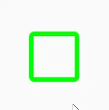
Checkbox(
        checked = myState,
        onCheckedChange = { myState = it },
        colors = CheckboxDefaults.colors(
            uncheckedColor = Color.Green,
            checkedColor = Color.Yellow,
            checkmarkColor = Color.Magenta
        )
    )
Note: You can change the color of the disabled checkbox also using disabledCheckedColor parameter of colors function of the Checkbox.
Note: The checkbox function also takes an optional modifier as a parameter. We are not going to discuss modifiers in this post. Check out the post on the modifier.
Useful links:
Happy Coding 🙂
One thought on “Jetpack Compose Checkbox”