A floating action button (FAB) provides a quick and prominent way to trigger a primary action. While Jetpack Compose offers a standard FloatingActionButton, in this blog, we’ll explore how to create an extended version of the FAB using built-in ExtendedFloatingActionButton function.
Extended FABs are the most visually important button. It can have both icon and text at the same time or a single icon or single text as well. These can be more effective when an icon alone looks ambiguous.
Extended FABs have the same height as simple FABs. Let’s take examples:
Extended FAB
ExtendedFloatingActionButton function takes many parameters but only two are compulsory: onClick and content.
ExtendedFloatingActionButton(onClick = { /*TODO*/ },) {
            IconButton(onClick = { /*TODO*/ }) {
                Icon(imageVector = Icons.Outlined.Edit,
                            contentDescription = null)
            }
        }
ExtendedFloatingActionButton(onClick = { /*TODO*/ }) {
            IconButton(onClick = { /*TODO*/ }) {
                Icon(
                    imageVector = Icons.Outlined.Edit,
                    contentDescription = null
                )
            }
            Text(text = "Compose")
        }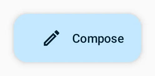
ExtendedFloatingActionButton(onClick = { /*TODO*/ }) {
            Text(text = "Compose")
        }
Customize Extended FAB
It has many parameters to style the extended FAB. Let’s see them one by one:
1. Shape
It defines the shape of FAB’s container
ExtendedFloatingActionButton(
            onClick = { /*TODO*/ },
            shape = CircleShape
        ){...}
ExtendedFloatingActionButton(
onClick = { /*TODO*/ },
shape = RectangleShape
){...}

2. Container Color
This color is used for the background of the floating action button.
ExtendedFloatingActionButton(
            onClick = { /*TODO*/ },
            containerColor = Color.Yellow
        )
3. Content Color
This colour defines the color of the content inside the extended FAB.
ExtendedFloatingActionButton(
            onClick = { /*TODO*/ },
            containerColor = Color.Yellow,
            contentColor = Color.Magenta
        )
4. Elevation
It is used to resolve the elevation for this FAB in different states. This controls the size of the shadow below the FAB.
ExtendedFloatingActionButton(
            onClick = { /*TODO*/ },
            elevation = FloatingActionButtonDefaults.elevation(16.dp)
        )
Note: There are two ExtendedFloatingActionButton function in the jetpack compose. You can see both functions on the Android developer website. Links are given below:
- Link for the function that we have discussed above
- Link for the function that we are going to discuss below
Let’s take an example of extended FAB with our second function:
It has three compulsory parameters:
- text – It is of type composable that describes FAB with text.
- icon – This is of type composable as well and gives an icon to FAB.
- onClick -This parameter is a lambda that triggers when extended FAB is clicked.
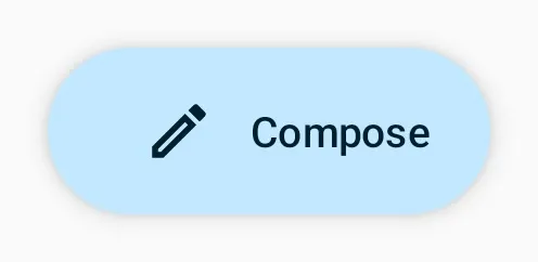
 ExtendedFloatingActionButton(
            text = { Text(text = "Compose") },
            icon = {
                Icon(
                    imageVector = Icons.Outlined.Edit,
                    contentDescription = null
                )
            },
            onClick = { /*TODO*/ }
        )
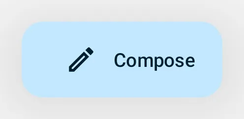
The second ExtendedFloatingActionButton function has a new parameter named expanded of type boolean and it also has a default value set to true. This expanded parameter controls the expansion state of extended FAB. In an expanded state, the FAB will show both the icon and text. In a collapsed state, the FAB will show only the icon.
Let’s take an example:
var myFABState by remember {
        mutableStateOf(false)
    }
ExtendedFloatingActionButton(
text = { Text(text = "Compose") },
icon = {
Icon(
imageVector = Icons.Outlined.Edit,
contentDescription = null
)
},
onClick = { myFABState = !myFABState },
expanded = myFABState
)
In the example above, firstly, we create a variable named myFABState of type boolean and set its value to false. Then we set this variable as a value to the expanded parameter of ExtendedFloatingActionButton and in the onClick lambda we reverse the value of myFABState so that when the user clicks the button it changes the value of myFABState to the opposite of itself. (If it is true then the value will be false or vice-versa.)
Some Useful links
Happy Coding 🙂