Layouts are essential components for creating UI and jetpack compose already supports some of them. And we are going to discuss these layout components of jetpack compose.
- Box – It stacks every child on top of each other. And default alignment will be
topstart. - Row – It places items horizontally on the screen in the available space. It is similar to
LinearLayoutwith horizontalorientationin view-based layout mechanism of Android development. - Column – It places items vertically on the screen means each item is below the previous one. Similar to
LinearLayoutwithverticalorientation.
Elements without Layout
Let’s have a look at some code without layout.
@Composable
fun FunctionName() {
    Text(text = "Android Development")
    Text(text = "Jetpack Compose")
}
Well without layouts in jetpack compose, elements don’t know where and how to place themselves. Layouts provide guidance to the elements.
Box Layout
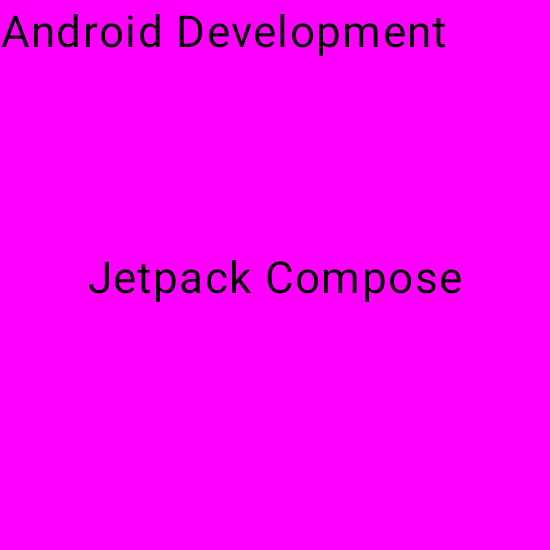
Box(modifier = Modifier.size(200.dp).background(Color.Magenta)) {
        Text(text = "Android Development")
        Text(text = "Jetpack Compose")
    }
Well, if you say it is similar to the previous one, then what is the benefit of the box layout? No, there are benefits of Box layout but to take the benefit we will use Alignment and Arrangement in layout. Let’s learn about them.
Alignment
It means an arrangement of something in a straight line. In the jetpack compose, it can be of nine types:
| TopStart | TopCenter | TopEnd |
| CenterStart | Center | CenterEnd |
| BottomStart | BottomCenter | BottomEnd |
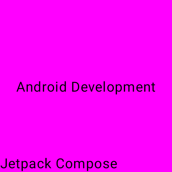
Alignment can be used in Box layout and we can align children or we can provide contentAlignment parameter to Box layout to set all children according to that, let’s see it in action.
Box(modifier = Modifier.size(200.dp).background(Color.Magenta)) {
        Text(text = "Android Development")
        Text(text = "Jetpack Compose", modifier = Modifier.align(Alignment.Center))
    }
Box(
        modifier = Modifier
            .size(200.dp)
            .background(Color.Magenta),
        contentAlignment = Alignment.Center
    ) {
        Text(text = "Android Development")
        Text(text = "Jetpack Compose", modifier = Modifier.align(Alignment.BottomStart))
    }
Arrangement
It is used to specify the arrangement of children in Column and Row layouts in the axis direction (horizontal and vertical). There are some predefined values to both arrangements:
- Horizontal – Start, End, Center, Space Evenly, Space Between, Space Around
- Vertical – Top, Bottom, Center, Space Evenly, Space Between, Space Around
Visual representation of these arrangements will be discussed in the Row and Column section.
Row Layout in Jetpack Compose
The row layout places its child horizontally on the screen.
 Row(
        modifier = Modifier.fillMaxSize(), horizontalArrangement = Arrangement.SpaceAround
    ) {
        Text(text = "Start")
        Text(text = "End")
        Text(text = "Center")
    }
Column Layout in Jetpack compose
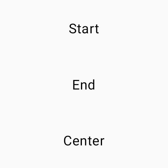
Column(
        modifier = Modifier.size(200.dp),
        horizontalAlignment = Alignment.CenterHorizontally,
        verticalArrangement = Arrangement.SpaceAround
    ) {
        Text(text = "Start")
        Text(text = "End")
        Text(text = "Center")
    }
To set the children’s position within a Row, set the horizontalArrangement and verticalAlignment arguments. For a Column, set the verticalArrangement and horizontalAlignment arguments.
 Row(
        modifier = Modifier
            .fillMaxWidth()
            .padding(16.dp),
        verticalAlignment = Alignment.CenterVertically
    ) {
        Image(
            painter = painterResource(id = R.drawable.cat),
            contentDescription = "cat image",
            modifier = Modifier
                .size(60.dp)
                .clip(CircleShape),
            contentScale = ContentScale.Crop
        )
        Column(
            modifier = Modifier.padding(16.dp),
            verticalArrangement = Arrangement.SpaceEvenly
        ) {
            Text(
                text = "A cat Image",
                fontWeight = FontWeight.Bold
            )
            Text(text = "I love cats")
        }
    }
SpaceEvenly – It places child elements across the main axis, including free space before the first and the last child.
SpaceBetween – It places child elements across the main axis, without free space before the first and after the last child.
SpaceAround – It places child elements across the main axis with half of the free space before the first and after the last child.
One thought on “Jetpack Compose Layout”