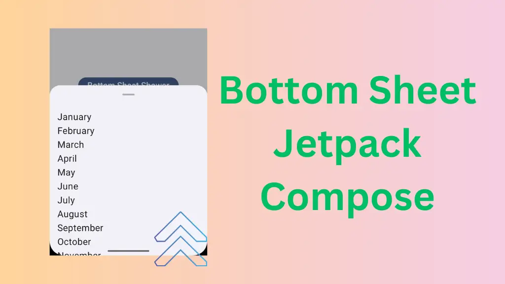
Bottom Sheet in Jetpack Compose is a flexible container that pop up from the bottom of the mobile screen. Bottom Sheets are so flexible that they can adpat to their contents and available space on the screen. The jetpack compose provides two types of bottom sheet:
- Modal Bottom Sheet – It is only provide bottom sheet
- Bottom Sheet Scaffold – This one provides both bottom sheet and screen’s main UI and user can interact with both at the same time.
In this article, we take a look at the implementation of both bottom sheets available in default material 3 library.
Setup Needed
We have created a Button in the Column and it is in the center of the screen. We use this button to launch the Modal Bottom Sheet. And make sure to update your bom to latest version in build.gradle.kts file.
    Column(
        modifier = modifier.fillMaxSize(),
        verticalArrangement = Arrangement.Center,
        horizontalAlignment = Alignment.CenterHorizontally
    ) {
        Button(onClick = {  }) {
            Text(
                text = "Bottom Sheet Shower",
                fontSize = 22.sp
            )
}Bottom Sheet in Jetpack Compose
Modal Bottom Sheet
The default implementation of modal bottom sheet takes only one parameter which is onDismissRequest. Let’s see how we can implement the this bottom sheet:
First of all we create a boolean variable so that we can use it in our button onClick lambada to keep track of modal bottom sheet. And we create an another variable to keep track the state of modal bottom sheet.
var sheetController by remember { mutableStateOf(false) }

val sheetState = rememberModalBottomSheetState()
Now, we change sheetController variable value to true when user click button by passing it in onClick lambda.
...
Button(onClick = { sheetController = true }) {
...
Finally, we check the value of sheetController in if block, if it is true then call Modal Bottom Sheet
        if (sheetController) {
            ModalBottomSheet(
                onDismissRequest = { sheetController = false },
                sheetState = sheetState
            ) {

            }
As you can see in the above code, we have passed sheetState and changed sheetController to false in onDismissRequest parameter which triggers when user tap outside the bottom sheet container.
Note: If we doesn’t provide any value in the onDismissRequest lambda then it will close the bottom sheet when user taps outside the container but you can not launch the bottom sheet again because the sheetController variable is still true so make sure to change it to false.
The last parameter of the ModalBottomSheet composable is the ColumnScope Content so anything we provide in the last lambda will be placed vertically.
Read Our Latest Blog Post on Date Picker in Jetpack Compose
Now we create an another composable function called MonthProvider which when called shows a list of all month in LazyColumn.
@Composable
fun MonthProvider(modifier: Modifier = Modifier) {
    val monthList = listOf(
        "January",
        "February",
        "March",
        "April",
        "May",
        "June",
        "July",
        "August",
        "September",
        "October",
        "November",
        "December"
    )
    LazyColumn(modifier = modifier) {
        items(monthList) { month ->
            Text(
                text = month,
                fontSize = 24.sp,
                modifier = Modifier.padding(4.dp)
            )
        }
    }
}
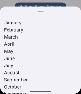
Now we call the above given function as the last parameter of ModalBottomSheet
        if (sheetController) {
            ModalBottomSheet(
                onDismissRequest = { sheetController = false },
                sheetState = sheetState,
            ) {
                MonthProvider(modifier = Modifier.padding(16.dp))
            }
        }
The whole code for the modal bottom sheet is given below:
    var sheetController by remember { mutableStateOf(false) }

    val sheetState = rememberModalBottomSheetState()

    Column(
        modifier = modifier.fillMaxSize(),
        verticalArrangement = Arrangement.Center,
        horizontalAlignment = Alignment.CenterHorizontally
    ) {
        Button(onClick = { sheetController = true }) {
            Text(
                text = "Bottom Sheet Shower",
                fontSize = 22.sp
            )
        }
        if (sheetController) {
            ModalBottomSheet(
                onDismissRequest = { sheetController = false },
                sheetState = sheetState,
            ) {
                MonthProvider(modifier = Modifier.padding(16.dp))
            }
        }
    }
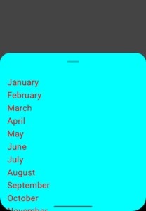
We can also provide colors to the this modal bottom sheet.
            ModalBottomSheet(
                onDismissRequest = { sheetController = false },
                sheetState = sheetState,
                contentColor = Color.Red,
                containerColor = Color.Cyan,
                scrimColor = Color.DarkGray
            ) {
                MonthProvider(modifier = Modifier.padding(16.dp))
}- contentColor – It is the main content of the bottom sheet.
- containerColor – It is the background of the bottom sheet.
- scrimColor – This color is applied to the main screen which is half covered by the bottom sheet.
The output with color is:
This was all about the Modal Bottom Sheet in jetapck compose android. There are many options to explore. As the best way of learning is by doing it yourself. I recommend you to explore all the options available in the modal bottom sheet composable function.
Bottom Sheet Scaffold
It is a standard bottom sheet which co-exist with screen’s main UI. And user can interact with both bottom sheet and main UI simultaneously. Let’s see how it’s implement:
    BottomSheetScaffold(sheetContent = ) {

    }
The above given code is the basic implementation of Bottom Sheet Scaffold. The sheetContent parameter is of type ColumnScope. Everything inside this lambda will be placed vertically.
    BottomSheetScaffold(
        sheetContent = {
            Icon(
                imageVector = Icons.Default.Favorite,
                contentDescription = null,
                Modifier.padding(24.dp)
            )
        }{

        }
The last parameter of Bottom Sheet Scaffold is of type composable function which takes paddingValues as a parameter. And this lambda’s content which is the screen’s main UI content.
    BottomSheetScaffold(
        sheetContent = {
            Icon(
                imageVector = Icons.Default.Favorite,
                contentDescription = null,
                Modifier.padding(24.dp)
            )
        }
    ) {
        Column(
            modifier = modifier
                .padding(it)
                .fillMaxSize(),
            verticalArrangement = Arrangement.Center,
            horizontalAlignment = Alignment.CenterHorizontally
        ) {
            Button(onClick = { /*TODO*/ }) {
                Text(text = "Show Bottom Sheet")
            }
        }
    }
Output:
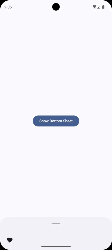
The above given example of bottom sheet scaffold is just a general overview. To have a detailed look, i recommend every reader to visit my Youtube Channel. I hope this blog adds some knowledge to your knowledge bank. Thanks for visiting.
Happy Composing 🙂
